Setting the Gold Standard
Consolidating Tide’s fragmented payment journeys into a single flow that set the UX benchmark for the rest of the app.
Contents
- 01 —Context
- 02 —The Problem
- 03 —Strategy
- 04 —Designed from usage data
- 05 —Built to extend
- 06 —Final UI
- 07 —Results
Context
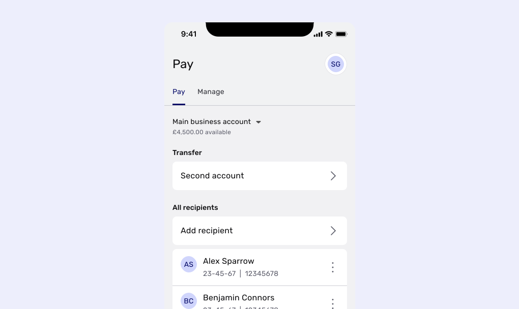
Redesign Tide’s core domestic payment experience, giving UK SMEs a single, seamless way to pay suppliers and staff.
Changing the feature members relied on most, without disrupting it. Several legacy journeys, each with its own rules, validation and edge cases, had to become one flow. And because payments were so central, the new flow had to set the standard for the rest of the app, and be built to carry international payments later.
A single payments flow that met all its success metrics within three weeks of launch, with no loss of revenue. Flow churn fell 40%, NPS rose seven points, and its modular components became the foundation for the international payment features I went on to deliver.
The Problem
Payments were the heart of Tide’s product, directly responsible for around 95% of its revenue at the time. But members reached them through several fragmented legacy journeys. Each had grown separately, with its own rules and edge cases, and payment management tools such as Direct Debits and scheduled payments sat in places members didn’t expect.
My heuristic review of the existing flows found 37 notable points: 13 severe issues, 11 intermediate issues, and 13 things that were working well and worth keeping. I prioritised them against our objectives and by impact versus effort.
13
severe issues in the existing payment flows
11
intermediate issues
13
strengths worth protecting
The risk cut both ways. Leave the journeys fragmented and every future payment feature would add to the mess. Change them carelessly and we’d disrupt the transactions members’ businesses depended on.
Strategy
A vision to build against
Over two days, Arnoud (our PM), Katie (our UX writer) and I ran workshops to define the vision for payments: who it was for, what problems it solved, what it was and wasn’t, and what it should and shouldn’t do. We drew on Tide’s own data and external research from Accenture and McKinsey, and wrote a statement that would act as a guardrail for every future update and integration.
For SMEs who need to carry out essential tasks as they grow, our payment flow is an experience-led stream that can evolve to tackle any demands. Unlike banks, our product is convenient, adaptable and non-intrusive.
The idea behind ‘stream’ was a river: one main flow, with smaller tributaries feeding into it. Wherever a member started, they would join a flow that was familiar and wholly governed by our team.
Objectives

Align with business OKRs on member satisfaction and revenue

Given its popularity, make payments the company’s gold standard for UX

Lead with what members need, not our technical limitations

Bring scattered payment management features into a single payments hub
Familiarity over novelty
We reviewed payment products from challenger banks, high street banks and investment apps, and almost all had converged on the same pattern: one screen for amount and reference, with a toggle to reveal scheduling options.
Making a payment is functional, and it depends on trust. Reinventing it would have asked members to relearn something they did every day. So I chose external consistency and familiarity, and put our effort into removing friction from the moments members repeated most.
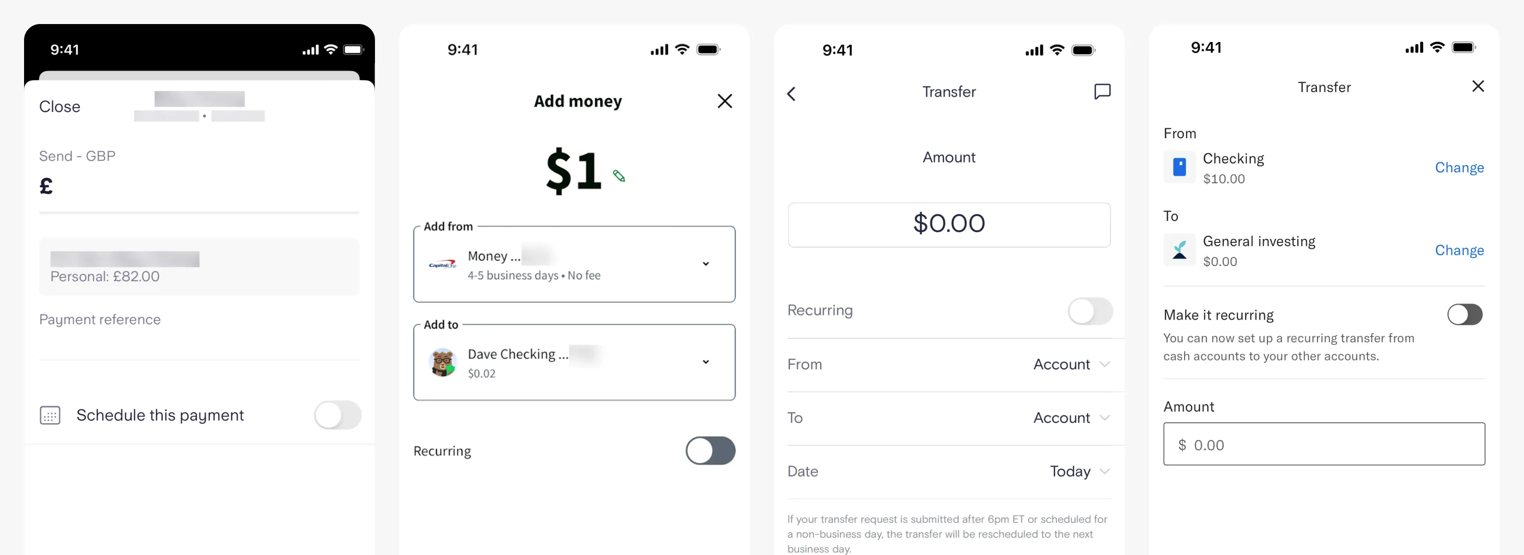
That decision also changed how we worked. With no need to explore exotic interaction models, I went almost straight into high-fidelity UI, and spent the time saved on the data.
Designed from usage data
We went back to our discovery data to find where the flow could do more of the work for members.

46% of payments by active members went to one of their three most recent recipients

19% of payments by active members came less than three minutes after the previous one

80% of payments by members with multiple accounts came from their primary account

Over 65% of scheduled payments were ‘send once’ and ‘tomorrow’

Managing Direct Debits and scheduled payments lived in unintuitive places

In usability testing, every participant expected to return to the Account tab after paying
Built to extend
We worked closely with engineering and compliance to bridge legacy limits with a modern UI, so daily business transactions weren’t disrupted at any point.
I designed payment cards, recipient selectors and status states as modular, reusable components. That meant future teams could add foreign currency and multi-currency rails without changing members’ mental model of paying, or rewriting the UI. Those components also expanded Tide’s wider design system, which I also led.
Final UI
Domestic payment
The everyday journey: choose a recipient, add the amount and a reference, then confirm from a summary that reads from payer to payee. The primary account was pre-selected, since 80% of payments came from it, but switching was a tap away.
Scheduled payment
Scheduling was a switch on the same screen rather than a separate journey. Turning it on revealed the date and frequency, pre-set to tomorrow and ‘send once’ to cover nearly two-thirds of scheduled payments in a single tap; members could still pick another date or set it to repeat.
Results
With around 95% of Tide’s revenue running through payments, success meant improving the experience without putting payments at risk. The new flow met all its success metrics within three weeks of launch, with no loss of revenue.
40%
reduction in flow churn (8.41% to 5%)
7
point increase in NPS (68 to 75)
9%
reduction in time-on-task
0
change in payment completion, through a full rebuild
What it made possible
The modular structure did what it was designed to do. On top of it, I went on to deliver the ability to receive GBP over SWIFT and EUR over SEPA from overseas, Strong Customer Authentication (SCA/3DS) and Confirmation of Payee, without reworking the core flow. It also met the objective we set at the start: payments became the reference point for UX across the rest of the app.
This was a deeply collaborative project. Arnoud, Katie and I worked closely together over several months, and every decision was backed by research and data.