Designing for Operational Growth
Writing and delivering the strategy for the next phase of OakNorth’s business banking app.
Contents
- 01 —Context
- 02 —The Problem
- 03 —Strategy
- 04 —Setup guide
- 05 —Explore
- 06 —Results
- 07 —Next steps
Context
To turn a product customers described as ‘basic’ and ‘forgettable’ into one that showed them what to do next, and why to do it with OakNorth.
I needed to make the case for design as a driver of the business’s commercial outcomes, not a layer of polish, with no dedicated engineering resource to deliver it.
A phased strategy that separated near-term deposits from long-term operational growth; a setup guide and a new Explore area shipped against it; and a roadmap for the next phase.
The Problem
The engagement gap
We were bringing customers in, so acquisition wasn’t a problem; engaging them was. Customers praised the speed of onboarding, but once through it, the product didn’t show them what to do next.
80%
of customers had deposited less than £100k; many had deposited nothing at all
5%
of customers ever saw the screen listing our savings accounts
70%
had opted out of marketing, so we couldn’t reach them through traditional channels
90
days until a customer was effectively impossible to re-engage
Customers who didn’t engage didn’t deposit, and customers who didn’t deposit didn’t generate revenue, which meant that the gap had significant commercial implications.
Why customers stalled
The features that would drive deeper engagement were split across platforms, not yet built, or buried in an information architecture that hadn’t grown with the product. For example, team invites were mobile-only; integrations and invoicing were web-only.
Around the same time, Ben (our PM) proposed refocusing our squad permanently on the post-approval, early-life experience. That gave us the remit while the strategy gave us the direction.
Strategy
I wrote and drove a plan to refresh the Business Banking app, approved by design and product leadership. It stated that UX belonged above the line on the roadmap, not beneath it, as a poorly-designed feature costs the same to build as a well-designed one.
Tied to business outcomes
Rather than set design-specific goals, the plan mapped design’s contribution onto the outcomes the business was already tracking:

A guided first experience and clearer product signposting would reduce the number of customers holding a zero or minimal balance.

Restructuring the IA and aligning mobile and web would make operational tasks easier to find and complete.

A premium product impression and faster time-to-value would build the trust that turned customers into referrals.
Betting on operational growth
All three outcomes mattered, but they weren’t equal. To get deposits you need the best rate, simple as that - not something I could influence, unless we started putting rate stickers everywhere in the app.
The durable, defensible future was operational usage, where customers ran their day-to-day banking with us. But it was also the least understood part of the business, and the hardest to win. With our ICP, an operational customer was a switch, not a sign-up, and switching comes with a whole host of objections to overcome.
Two tracks, two horizons
I separated two problems that were easy to run together, so each could be judged fairly, and was explicit about what design did and didn’t own.
Commercial-led; design supports. Won by rate, sales and a smoother deposit mechanism. Design contributes through onboarding, activation and making our savings range visible.
Design-led. Understanding what would make a business move its day-to-day banking, and designing the product moves that would make the switch worth it.
Who to focus on
UK SMEs almost never switch banks, but when they do it’s because of a specific capability gap, not just general dissatisfaction.
~0.5%
of UK SMEs switched bank in a typical year (CASS)
~50%
of businesses surveyed had changed provider to access faster payments
Looking through our customer data, I identified one lead segment: Information & Communication businesses, particularly B2B software, tech services and PropTech. They activated fastest, built balances quickest and had the highest card adoption of any sector.
I framed the segment as a hypothesis to test: we’d conduct an attribution review of how these customers actually arrived, and jobs-to-be-done interviews with non-customers about what would make them switch.
Options considered
With the direction set, the question was how to deliver it.
Continuing to deliver features into the existing experience. Rejected: this was how we got here. New features landing in a fragmented IA risked low adoption, regardless of their quality.
Pausing delivery for a ground-up redesign. Rejected: the business couldn’t pause, and we needed to know more about the solution before committing to it.
Using features already committed to the roadmap as delivery vehicles, refreshing the experience, and the IA, as each one landed.
The biggest constraint was resourcing, as no engineering had been allocated to the refresh itself. Our plan meant the refresh shipped with real product changes rather than competing with them. Anything outside those vehicles was designed to a build-ready state, ready for when resource followed.
The first two moves served both tracks: helping savers reach their first deposit faster, while capturing intent and giving the product a structure that could surface operational features over time.
Setup guide
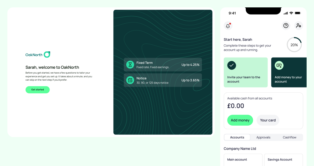
Before this, a newly approved customer opened the app to an empty balance and nothing else. We designed a short, intent-led journey instead:

A couple of questions to identify the main reasons for applying

Savings-led customers could open the right account immediately

Inviting the finance director or CFO who would actually run the account

Clear instructions and confirmation that money was in the right place
Capturing intent
We had no data on why customers opened accounts with us. The fact-find gave us first-party data on intent, such as savings, payments or FX, and it became the starting point for understanding why customers chose us.
Opening a savings account
Savings-led customers were prompted to choose an account, with an interest estimator to compare options.
Reaching the real user
For companies with £1m–100m revenue, the director who applied was rarely the person running the finances. Prompting the applicant to invite the finance lead at a key moment, rather than hoping they’d find the feature themselves, meant all future efforts would reach the right person.
Getting to first deposit
Because our savings accounts couldn’t be funded directly, we guided customers through the transfer and confirmed when their money had landed. We pitched Open Banking funding as the longer-term fix.
Explore
The only way to see our savings accounts was a small quick-action button on the homepage, leading to a basic list. For a business that relied on deposit volume, a 5% visit rate was a significant missed opportunity.
I proposed a new top-level navigation item, originally Apply and later renamed Explore, giving products a permanent, browsable home organised by category. It was the first step in restructuring the app’s IA, and designed to grow into a marketplace for promoting any new feature, not just new accounts.
Results
Neither move needed new backend functionality. Both were about learning more about customers and surfacing what we already offered.
3×
traffic to savings products after launching Explore
41%
rise in savings account openings
28%
of new customers invited a colleague right away
5
fewer days to first deposit (7.5 to 2.5)
13%
jump in customers meeting minimum deposit requirements
Next steps
The setup guide was originally designed with an operational path, introducing payments, cards and integrations. Because short-term revenue came from deposits, we shipped the lighter, savings-led version first. The operational path was the next step on the roadmap.
Roadmap
Setup guide
Explore
Web onboarding MVP
Operational path in the setup guide
IA restructure for operational products
Self-serve roles, permissions and bulk invite
Non-linear, cross-platform onboarding
Customer growth intelligence
API and embedded banking, sized by research
Futurecast scenarios revisited quarterly
Onboarding
Non-linear, cross-platform onboarding that let customers progress in their own order, on any device, and opened the process up to non-directors.
Operational path
The setup guide’s second route, introducing payments, cards and integrations to customers who needed more than savings.
Manage
Designed as a dedicated home for running the business: entities, accounts, team members, cards and permissions, with connected navigation between them.
Payments
A refreshed payments flow, from choosing a recipient through to review, built on the new design system and consistent across web and mobile.