My role
Design/Strategic Lead
Date
Summer 2020-Apr 2022
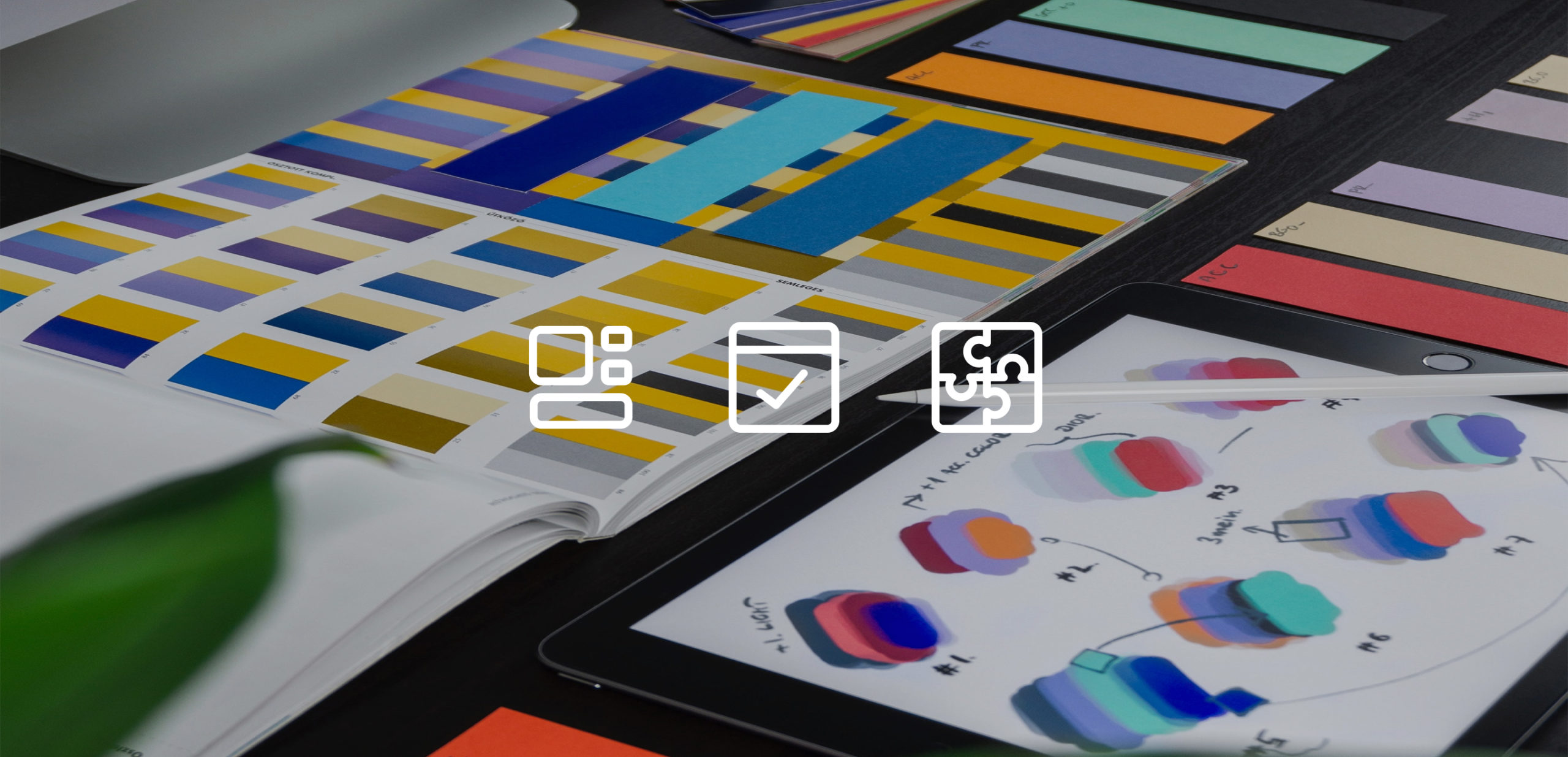
Tools used
Figma
Figjam
Zeroheight
Confluence
Invision
Team
Oscar Wong, Lead UI Designer
Alex Frewin, Head of Product Design
Liam Thomas, Product Designer
Katie Hayward, UX Writer
Tarunya Varma, Product Designer
Context
Problem
In Autumn 2020 Tide’s web and mobile engineering teams were planning to execute large-scale codebase migrations. I was approached separately by both, to provide new design components for them to use.
The DS we were using had a number of issues:
- Hard to navigate and locate components
- Not using newer Figma features
- Inconsistent naming conventions
- Lots of legacy assets still present
- No components available for the web app
- No documentation for either platform
Solution
This was a massive opportunity to modernise our Design System and create efficiencies within our own workflows.
Research & Discovery
Survey
To better understand how the wider business works with the DS day-to-day, I sent a survey to all design, product and engineering teams.
94%
interacted with the DS often
(44% did so every day)
88%
strongly agreed ‘the reason we have a DS is clear to me’
81%
strongly agreed ‘we should adhere to the DS where possible’
51%
disagreed ‘if I think a component needs updating, I know what the process is’
43%
agreed or strongly agreed ‘there is a clear connection between our design components and codebase’
44%
strongly agreed ‘I know which components should be used for a particular task’
Proposal for further exploration
I set up a meeting with heads-of from engineering, product and design to present our findings and propose our plan of action.
This was received enthusiastically, so we started right away with our discovery phase: auditing the existing DS and researching best-in-class DS examples.

Time/effort estimates
4 weeks of discovery, then 8 weeks of component design, split into 4 sprints of 2 weeks each

Existing components
Catalogued, categorised by function, then prioritised into the sprints

Governance
Specific objectives for project success and a RACI for all involved stakeholders

Roadmap
Higher-level plan for incorporating some of the new UI into our existing apps, ahead of migration
Objectives
I felt it was important to align the project to more vision-based objectives, rather than simply focus on deliverables.
We want to…
Create a universal language between design and engineering
Build a more logical and better constructed toolset
Write better instructions/guidelines of when and how the components should be used
Pave the foundation for the success of future experiences
Introduce a model of governance for how we can continue to evolve the Design System, and how others can contribute to it
Create templated flows for generic interactions to speed up design and product thinking
So that we can…
Spend less time designing simple customer journey UIs
Focus on the areas where we can engage users
Speed up MVP build for idea validation
Provide a much needed update to UI
Create consistency for our fundamental journeys
Speed up our users’ workflows
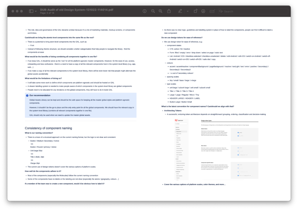
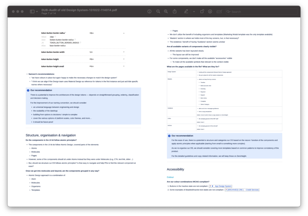
Audit
We began by doing a full audit of our existing asset library, using the following criteria:
- Global Assets Library (atomic elements)
- Consistency of component naming
- Structure, organisation & navigation
- Accessibility
- Guidelines & documentation
- ‘System layer’ & cross-platform consistency
- Fonts
- Handling of common flows (Load, Delete, Validation)
- Maintenance & governance principles
- Keeping things lean
Design
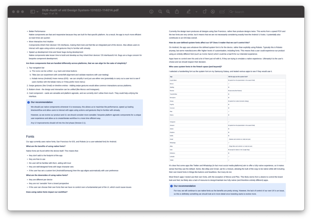
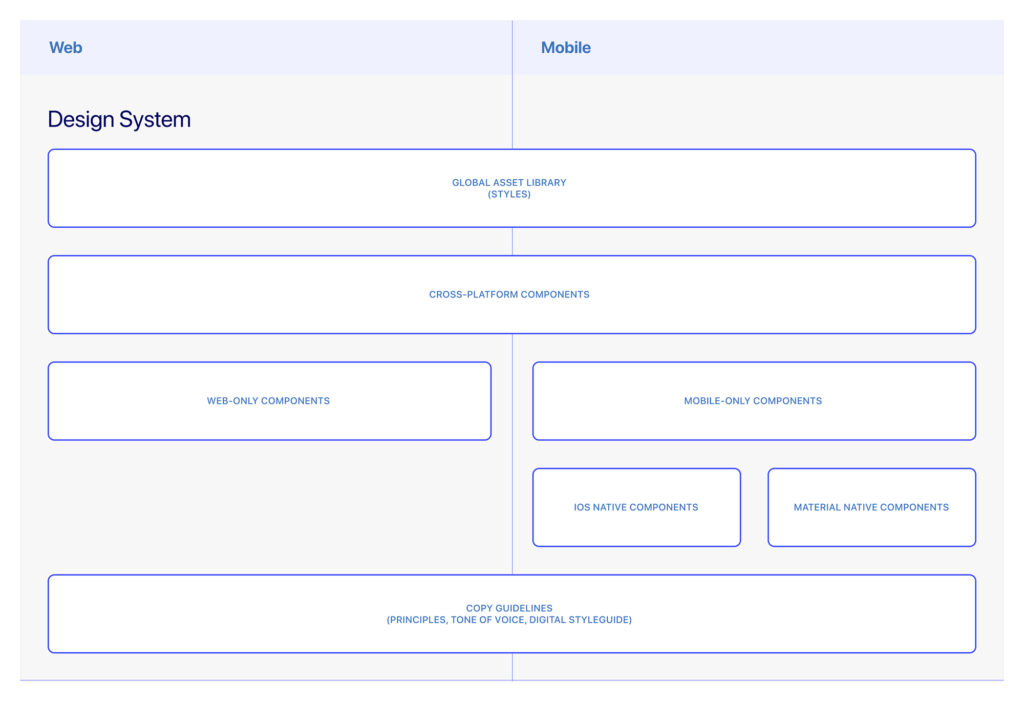
Cross-platform approach
Initially we had planned to keep the two platforms (web and native app) separate.
As our discovery progressed this made less sense, especially as the web platform was going to be fully responsive to three breakpoints.
Why have two components in a library when one can work across both?
This cross-platform foundation allowed us to create a single component library that supported both platforms, with 60% fewer components than before.
Creating components
Liam and I started working on the components I had outlined for each sprint. We had a visual direction to work with and I delegated most of the component construction to Liam, so that they would have a sole ‘owner’ and be more consistent. I provided creative direction, and defined the logic of how each new component would be used in future design work.
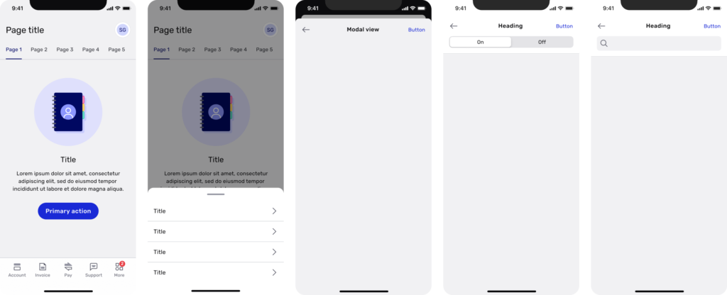
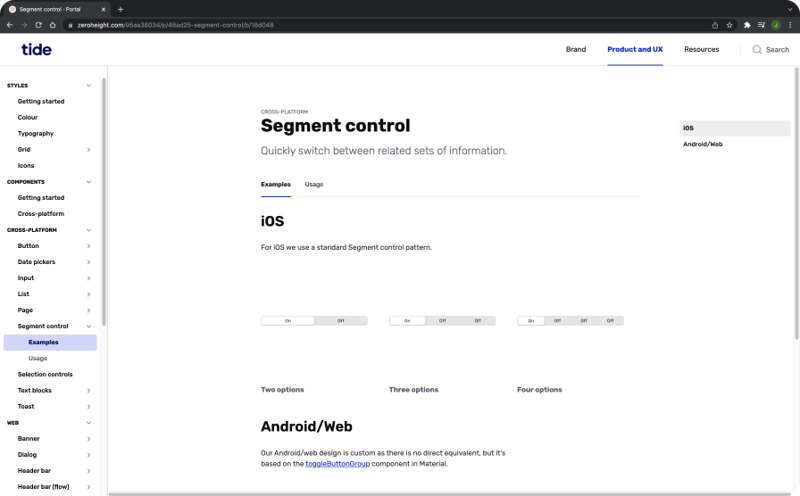
Examples

Information architecture
The apps suffered from poor IA that had built up over time. When the web app was built it was given a completely different structure to the mobile app, so the location of features isn’t immediately obvious.
Meanwhile, the mobile app had been added to iteratively, with little high-level product direction. Most new features had to live in ‘More’, which research had shown to have a very high failure rate for discoverability – as high as 80-90% in some cases.

As part of this project, we aligned the web app primary navigation to the mobile app, provided a scalable secondary nav component for both platforms, and separated options related to user details and preferences into a dedicated ‘user’ area.
Structural model for web
Large view with sidesheet for displaying items and small tasks; medium view with visible primary nav; small view with expanded user menu.
All breakpoints feature a persistent secondary navigation where required.

Structural model for mobile
Same primary navigation as web. Bottom sheets used to display overflow menus.
Modal views for same purpose as sidesheets. Tab controls and search incorporated into app header.
Documentation
To aid the designers in the team, and answer a pain point from my survey, I personally wrote over 100 pages of documentation for the components. I used Zeroheight, covering everything from correct component usage to writing consistent UX copy.


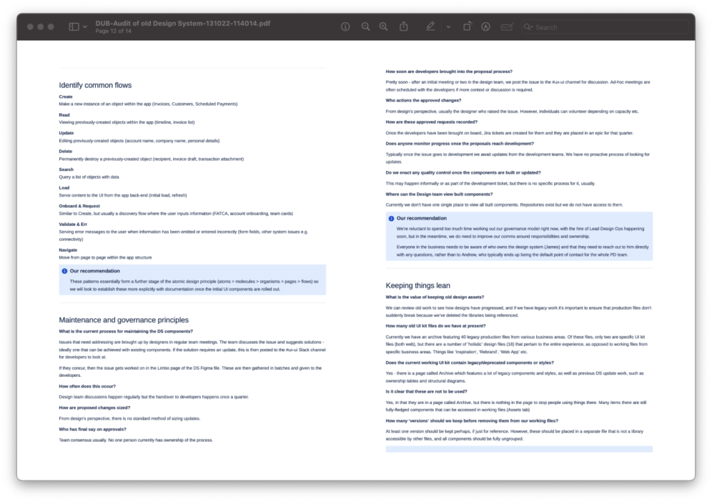
Maintenance, ownership & advocacy
Contribution model
One key takeaway from my survey was that just over half of respondents didn’t know how to make updates to the DS. Engagement and participation are crucial to adoption; designers will feel much more invested and willing to use the DS if they feel they have a hand in its future.
Once the bulk of the design work with Liam was done, I began to work on the governance aspect. I conducted some research, consulted with our designers and engineers, and outlined a full end-to-end contribution model from initial idea to shipping finished code.

Enabling conversation
Once the DS was active, I started gathering feedback from the design team. The sentiment was positive, although many felt that the comms could be improved.
They wanted to know what updates were being made, how their suggestions were progressing and how they could ask questions about usage.
In response, I created a dedicated Slack channel where we would post all significant updates. I also hosted a weekly 30-minute clinic where designers could drop in and ask any questions or share work.
After two months, around half of the design team had attended at least one session and we had logged nearly ten significant updates to be carried out.
Decentralising and delegating
Alex & I set up a steering committee to establish cross-department ownership. I reached out to seven senior engineers and PMs, and set up a monthly meeting, led by design, to discuss strategic concerns.
I also formalised a working group of two designers and two engineers, who would completely own the contribution process. They would be responsible for managing all component updates and comms to the wider business.
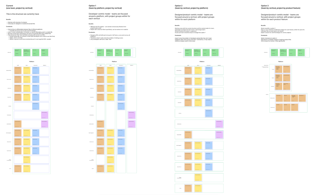
File structure
Finally, in order to ensure a seamless transition from one DS and product file set to another, the team needed a new set of files for the new design work to be completed in.
I set up an entirely new structure for all business areas — we now had clearer and lighter file structures, dedicated spaces for research/workshop materials, and more spaces for working and iteration.

Conclusion
The Portal design system is one of my favourite projects that I’ve worked on. It was deeply collaborative, drove incredible efficiencies and communication within the team and beyond, and helped to elevate my personal profile within the business by giving me dedicated face-time with senior stakeholders.
Tide now has a dedicated design system team with several designers working on it – I am incredibly pleased that my efforts to kick this project off have really taken root and picked up by others.
Personal learnings
The main thing I learned from this project is that for all the talk of design systems, particularly within the Figma community, most of it relates to creating UI. There is very little information around the planning, execution and ongoing maintenance – the latter of which I believe is the most important aspect of design system management by far.
Beautiful UI is great but if your team don’t know how to use it, or feel that they can engage with it, then the whole thing will wither and die. Design systems need to be treated like products within themselves, with continuous ongoing development and input.