
My role
Design Lead
Date
Apr-Oct 2022
Tools used
Figma
Figjam
Attest
Usertesting.com
Team
Eden Fish, Product Designer
Karl Koch, Product Designer
Harry Boteler, Product Manager
Victoria Palmer, Senior Product Manager
Smith Forte, Chief Product Officer
Context
Problem
There are over 18m people in the UK with £10,000 or more in low-interest savings or current accounts.
We believed that these people would benefit from financial advice, a service largely misunderstood and mistrusted by the general public.
Solution
If we could provide free, quality financial advice for all Moneybox customers, that would be a significant disruptor in the UK savings & investments market.
To test the idea, we created a service designed to help Lifetime ISA customers create a holistic savings goal for their first home. This was chosen for its commercial potential; revenue and x-sell are key metrics in the CX mission.
Research & Discovery
Prior efforts
The team had already completed some research prior to me joining the company – a competitor analysis, survey, and some initial prototypes which they had tested with customers.
All signs pointed to yes – we would create this feature with a view to expanding the proposition into the wider app experience.

Low numbers had received financial advice

Sought-after features: recommended accounts, goal tracking, financial coaching

Those that hadn’t received advice were typically in their 20s, with cash products

Most-wanted guidance: ‘how to invest’, ‘save my money’, ‘create an investment strategy’
User journey
The home-buying feature was split into four parts:

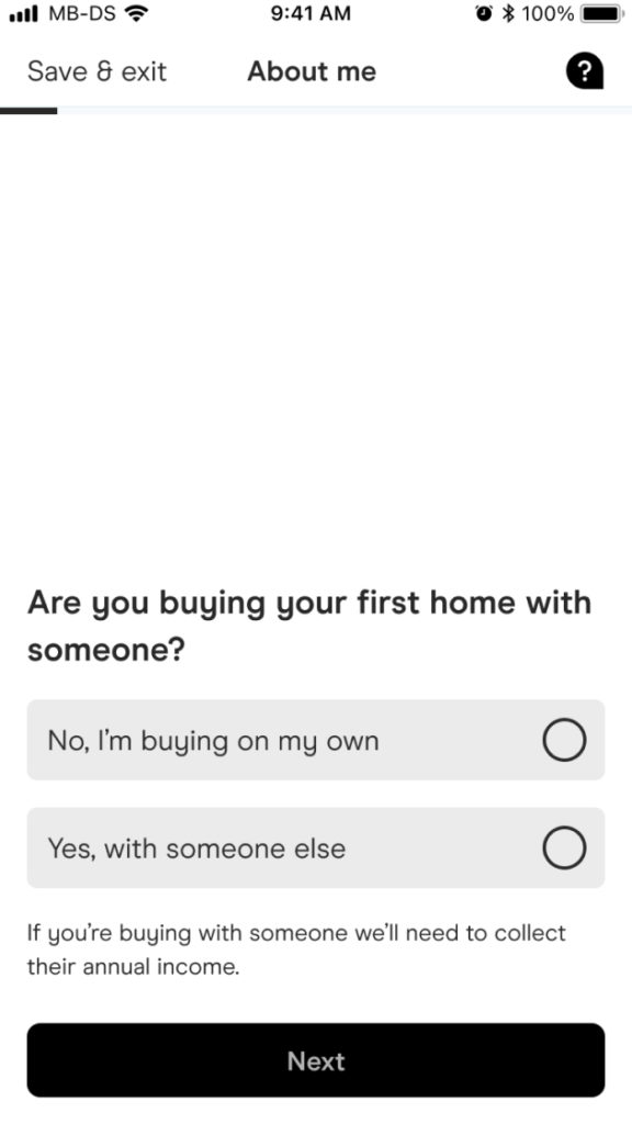
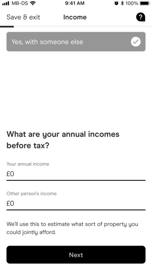
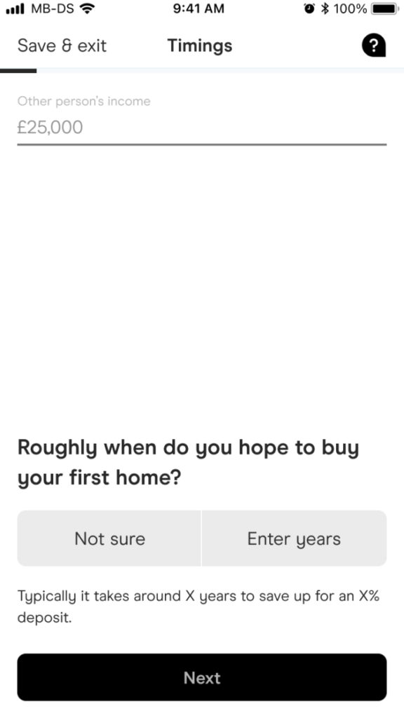
1 – Fact-find
Understand the customer’s situation
Enter salary, location, timeframe, solo/with partner

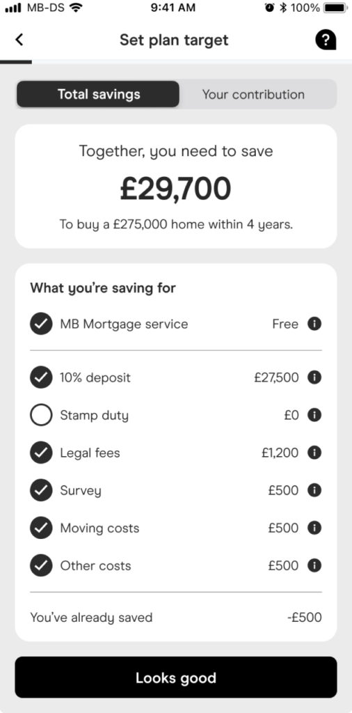
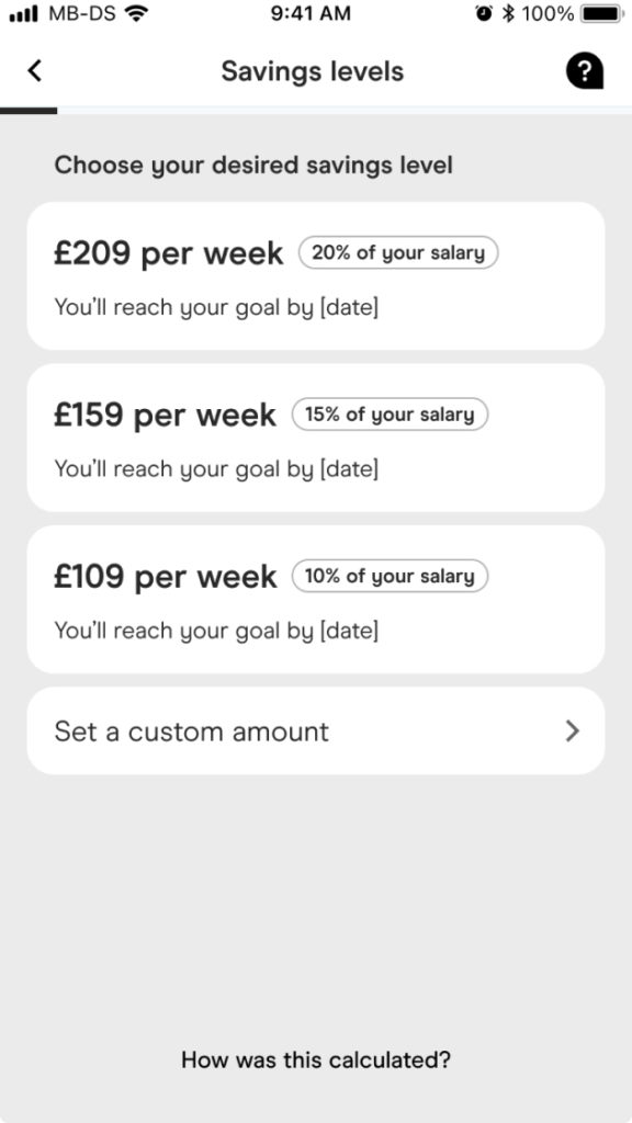
2 – Customise
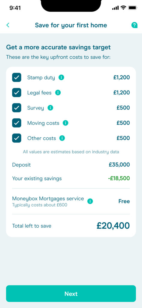
Get the most accurate savings figure
Select deposit %, additional fees, savings level

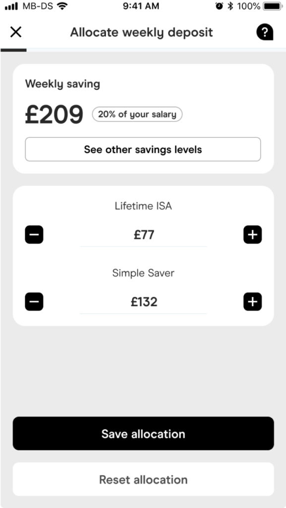
3 – Cross-sell
Save for non-deposit items – survey, moving
Choose from available savings accounts

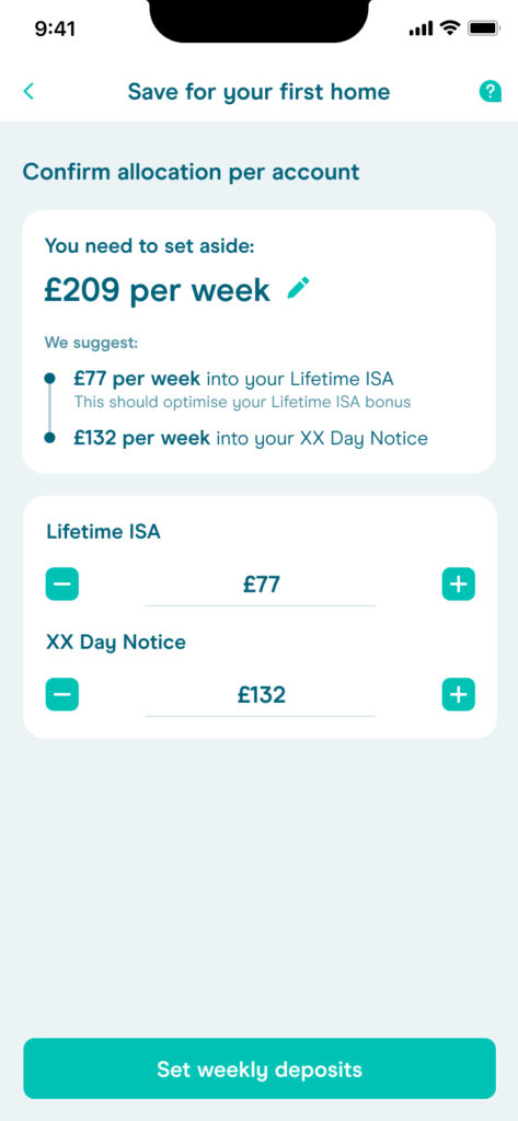
4 – Track
Monitor savings progress over time, and access other resources
View currently saved, overall target, account breakdown, other tools
Wireframes
Fact-find
Simple, continuously-scrolling form. This was an existing pattern within the app which made development straightforward, although it did limit the types of questions we could ask and information we could display.

Customise
Customers receive their basic target value from the fact-find, and use a number of controls to fine-tune it.


Cross-sell & Track
Lifetime ISA customers (the target audience) can only use this account for their house deposit. Everything else, such as a survey, moving costs, stamp duty, will need to be saved for elsewhere.
This part of the feature allows them to open a second account for these items and decide how to allocate their savings. Once finished, their Tracking screen is their ‘hub’ where they can view progress, update their savings amounts and access other related tools.

Final UI
Once we were happy with the overall flow, I began creating high-res versions of the screens. I leaned into our design system components as much as possible, even reusing existing illustrations to reduce overhead.
Where custom UI was needed, I liaised with our developers to ensure requirements were clear. I also conducted design QA during product review.
(Fact-find and Cross-sell portions of the flow used pre-existing UI, and so I haven’t included them here.)
Customise & Track

Further exploration
I also explored other ideas such as interstitial screens to break up the flow and prime the user for the next section; and milestones to make the target feel more achievable over long time periods.


Conclusion
The feature saw some early positive success – test participants reported that it was an innovative and useful feature, bringing to light aspects of home-buying they hadn’t considered previously.
51%
engagement with initial comms (company benchmark of 10%)
49%
engagement with the home-buying goal feature
10%
made positive contributions to their savings through the feature
4%
contacted our mortgages team to discuss buying a home
Personal learnings
Despite the project’s initial success, it also showed the value of a tight, well-defined MVP. The business chose this feature because of its revenue potential, but the complexity meant months of ideation, design and build.
As a proof-of-concept, it may have been better to start smaller e.g. savings pots, and enrich it over time with customisation options, ability to share goals with others etc.
Had the brief aimed to solve a customer problem rather than a business one, we could have created a real differentiator.