Context
Problem
The application journey at YouLend was facing several issues when I joined:
- Not optimised for mobile (65% of user sessions happened on mobile devices)
- Significant drop-off at specific points in the flow
- Lack of clear product ownership; feels fragmented, inconsistent and dated
- No major updates for nearly 3 years
Solution
While we weren’t looking to change the underlying functionality of the journey at all, we wanted to modernise the experience by overhauling the UI and rewriting the copy, helping guide users through the journey.
Research & Discovery
Analytics
Before I joined YouLend, Yvonne had spent time mapping the journey in Miro, and using Heap analytics to identify the most problematic steps in the journey.

Landing
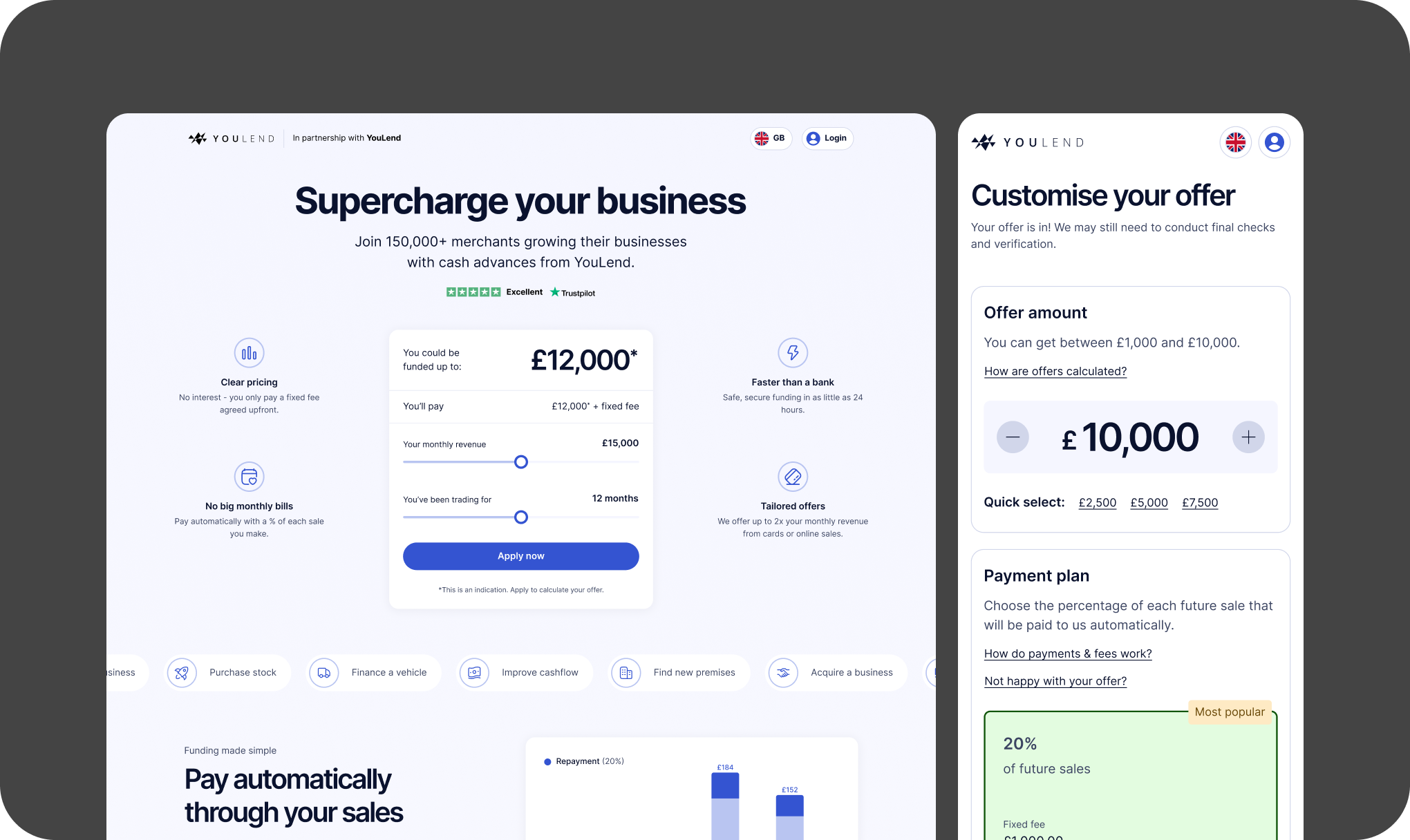
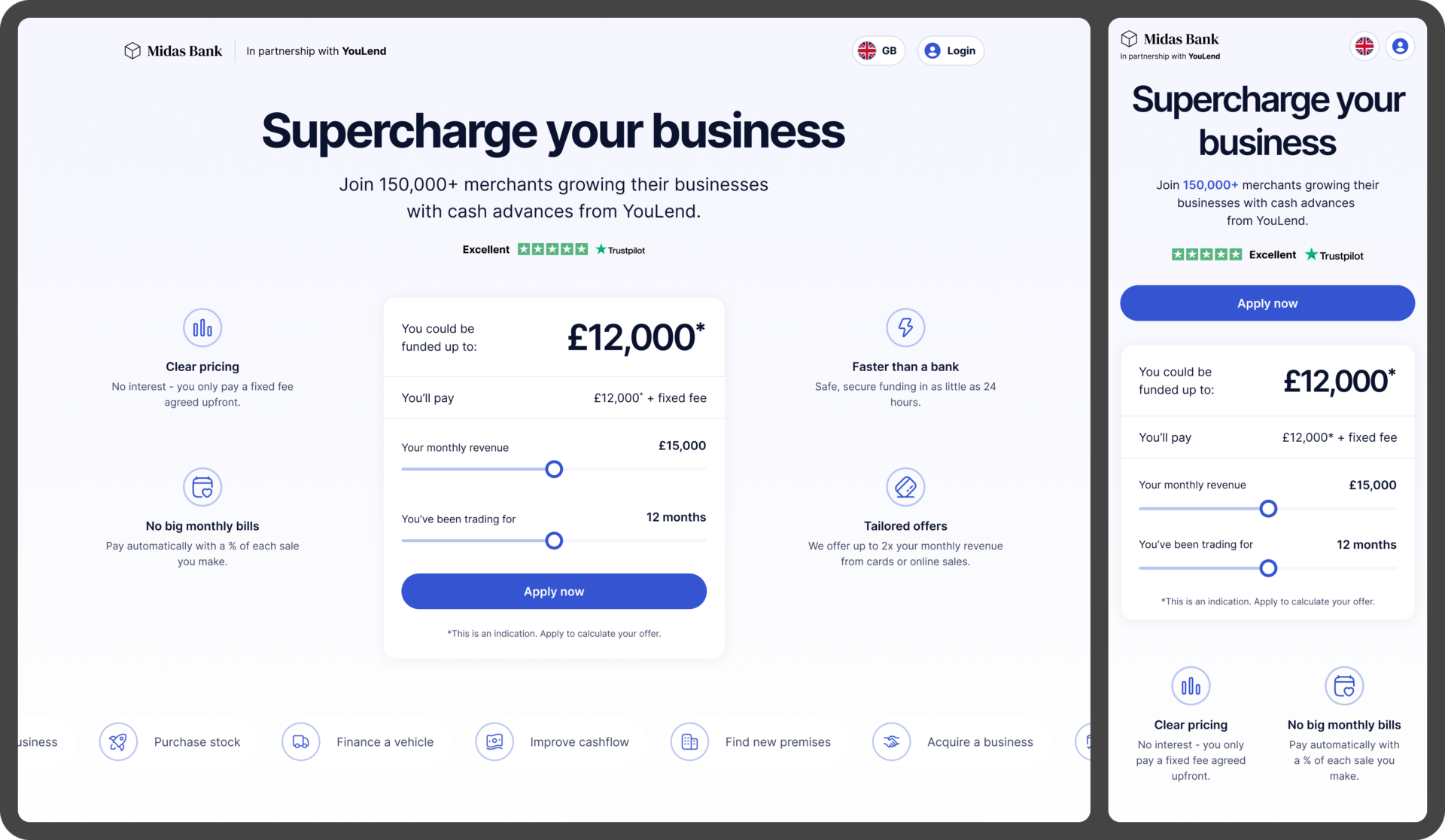
Landing page that explains the product, and an indication of what you can borrow

Business
Tell us your business name, type, country and address

Personal
Tell us about all shareholders who own at least 25% of the company

Financial
Connect to your business bank via Open Banking, or submit PDF statements
The biggest areas of drop-off were the Landing page (47% conversion) and Financial (56% conversion) – unsurprising as these were the areas that required the biggest ‘leaps-of-faith’.
Customer Support
Yvonne gathered feedback from our CS team, who said ‘help with sign up’ was one of their biggest support tasks. If a customer didn’t understand how to sign up, then the CS team would help them manually; a very laborious and time-consuming process.
Metrics
With this in mind, we aimed for the following metrics:

Increase in sign-up conversion (landing page)

Increase in Stage 1 conversion (submitting application)

Increase in customer NPS mentioning application
Design
Landing page
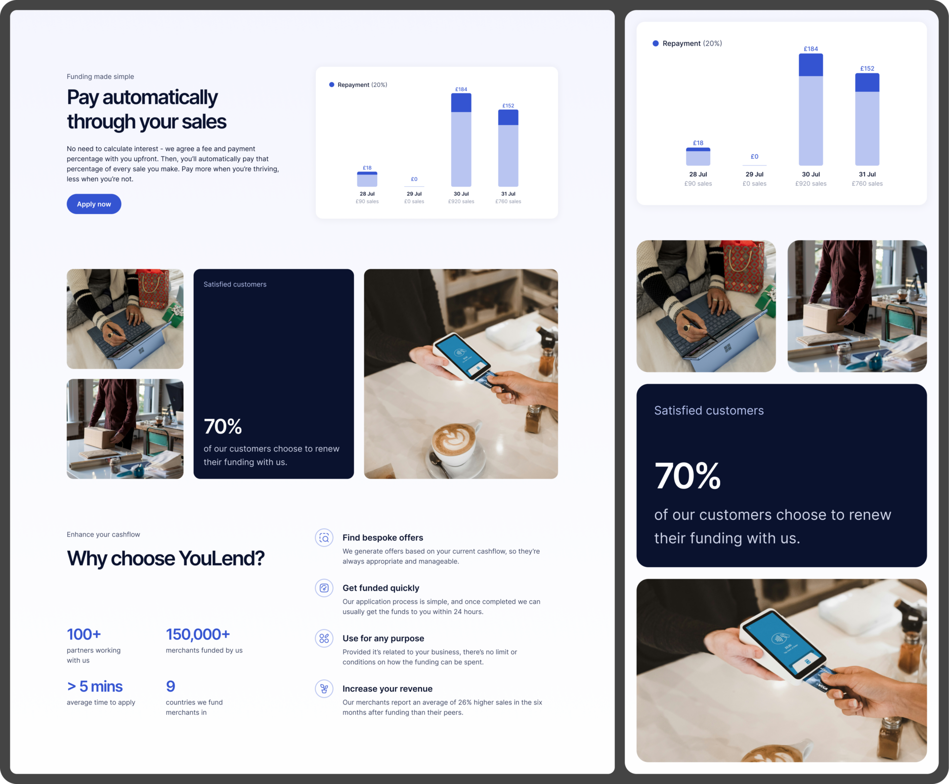
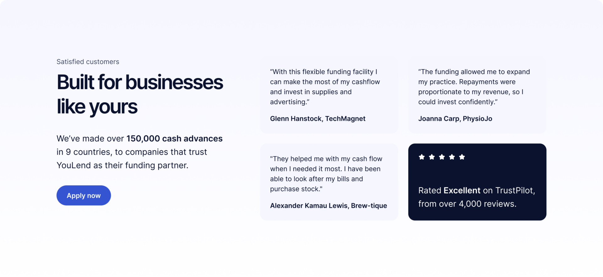
Complete redesign of the landing page to emphasise the product’s features + benefits, along with social proof and some key information.
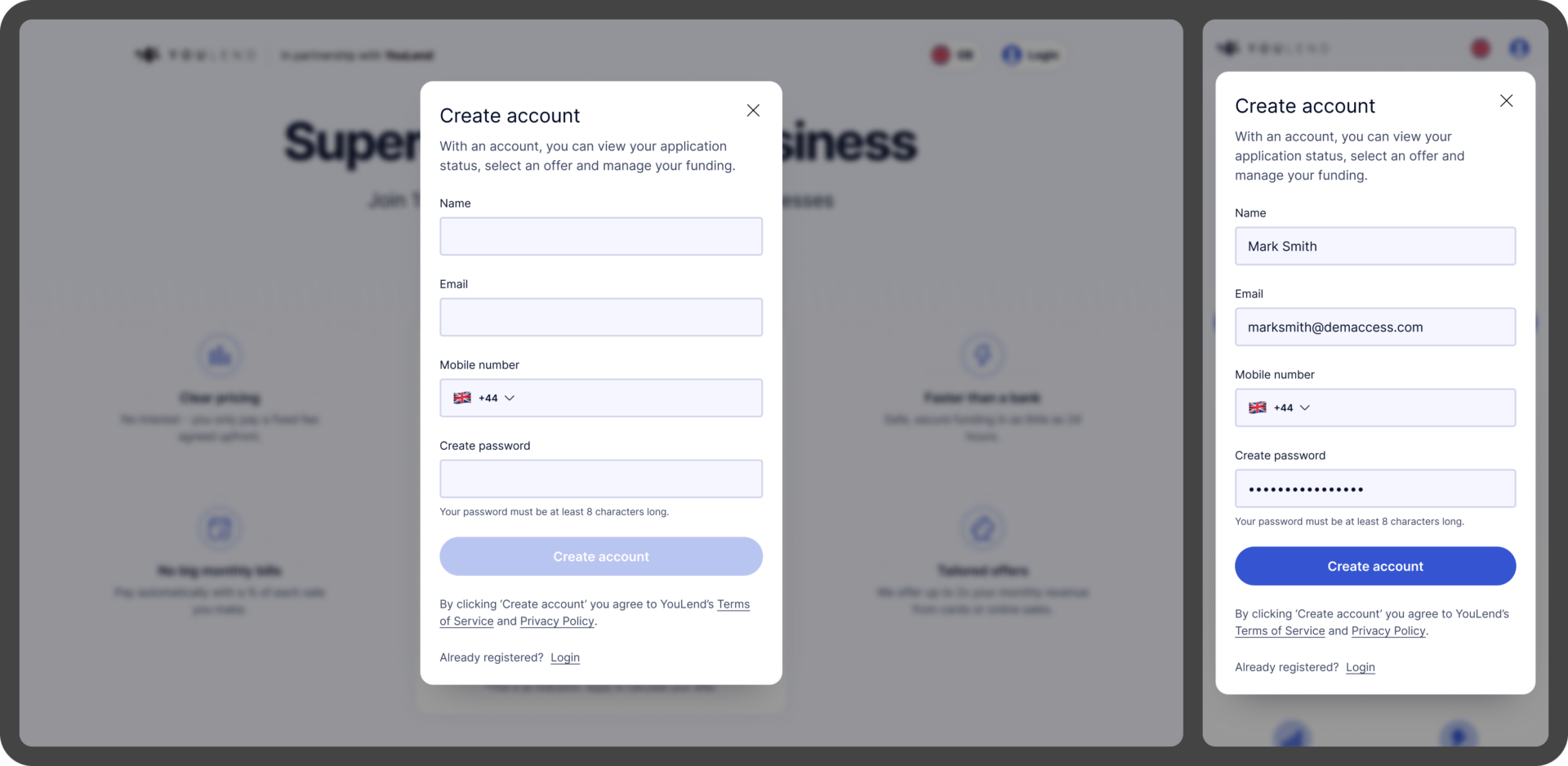
Account creation
Simple modal to capture customer details. Initially our hypothesis was that this was causing the drop-off, but according to some previous team discovery into passwordless sign-up, customers who hadn’t entered these details upfront were less likely to convert.
Form design
As mentioned before, mobile optimisation was crucial to this project, which ended up informing the design a lot – beyond the Landing page, the majority of the screens are single-column forms, cutting out any complexity for responsive layouts.
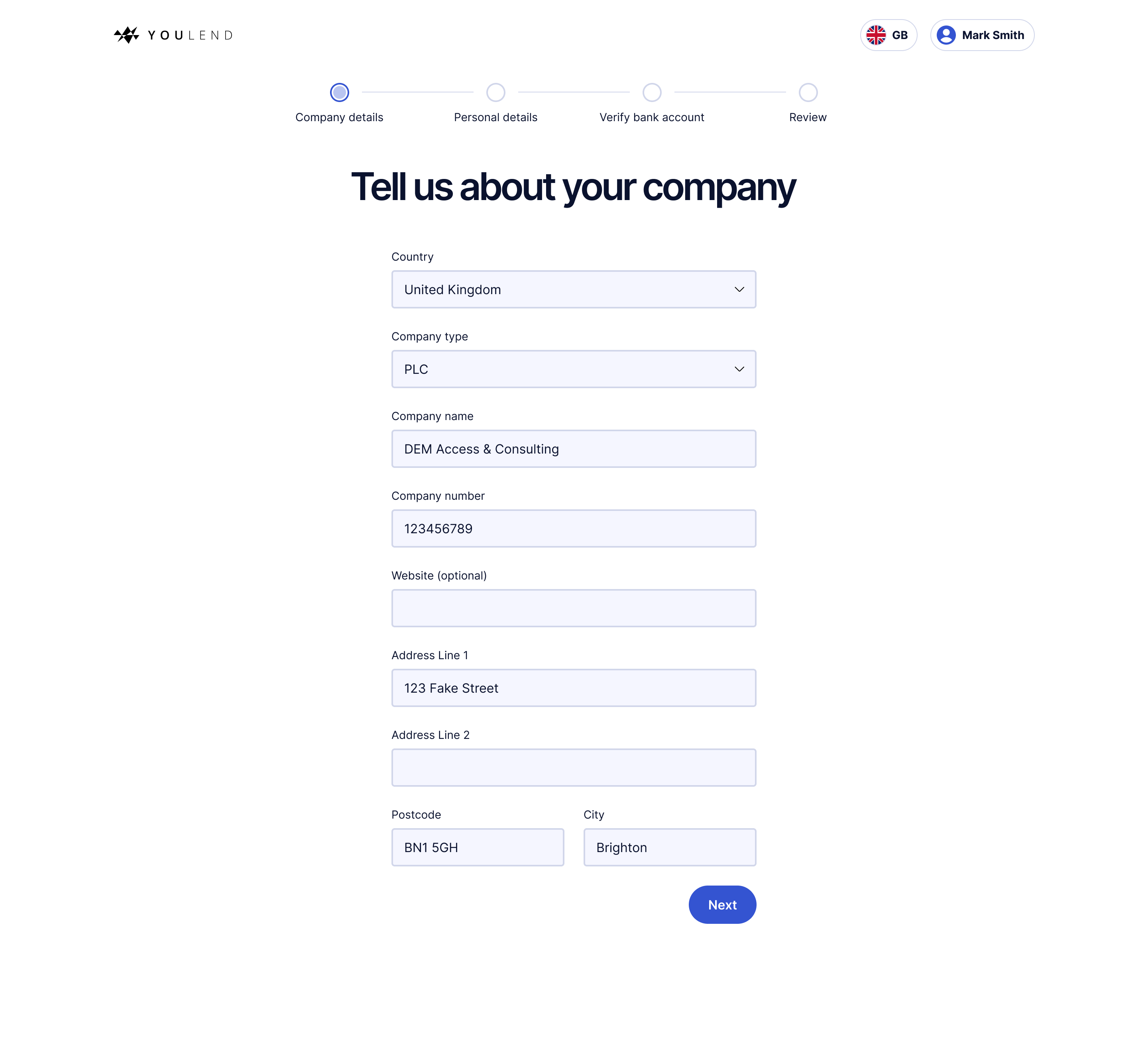
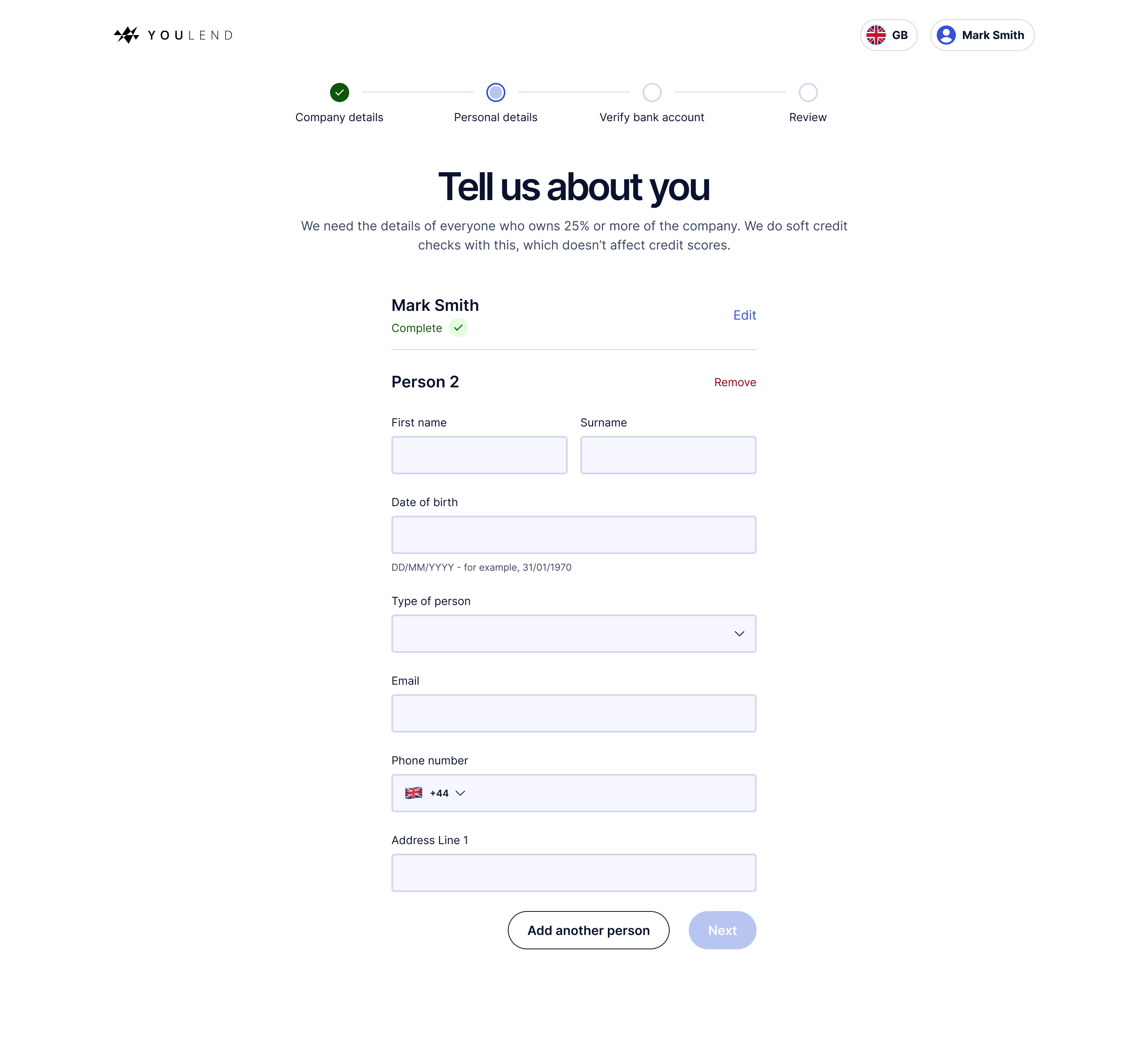
I looked to eCommerce UX principles to help streamline and guide the user – removing all navigation, providing a clear progress indicator and adding helpful copy, to explain why we were asking for particular information.
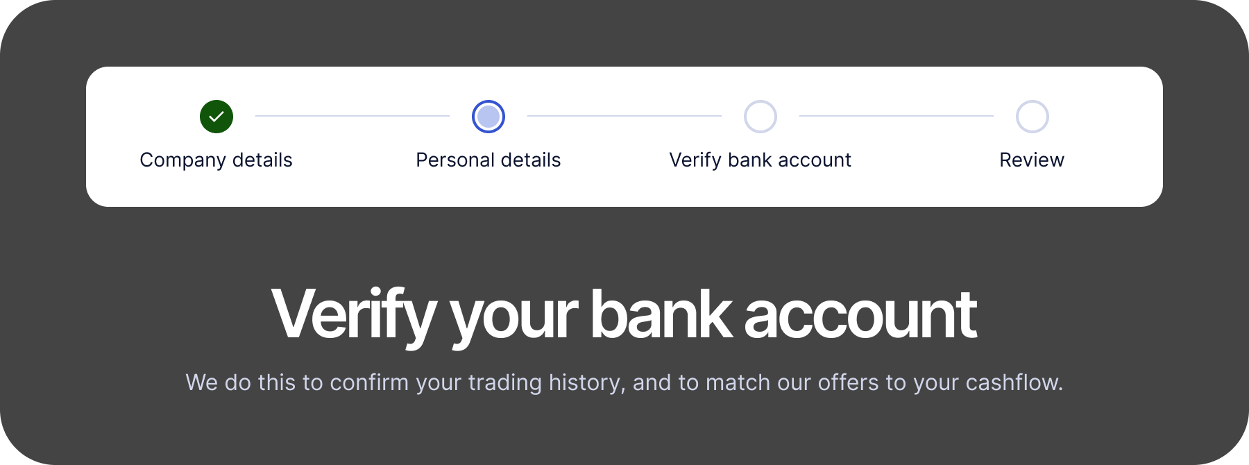
Financial information
As the other significant drop-off, this page was a priority. The old design was uninspiring (see below left) and didn’t explain the Open Banking connection particularly well. Customers said it didn’t feel safe, and they didn’t understand what they had to do.
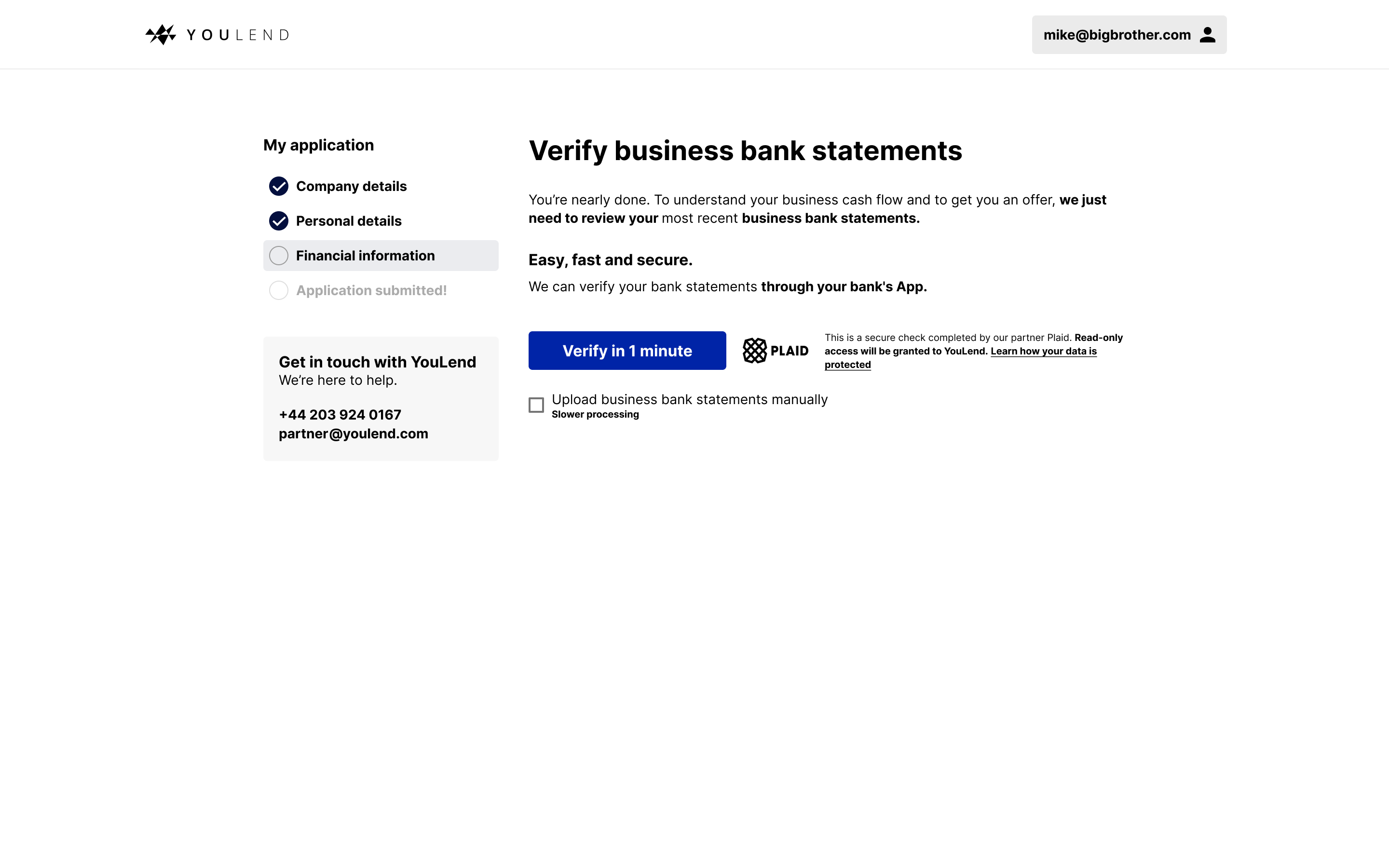
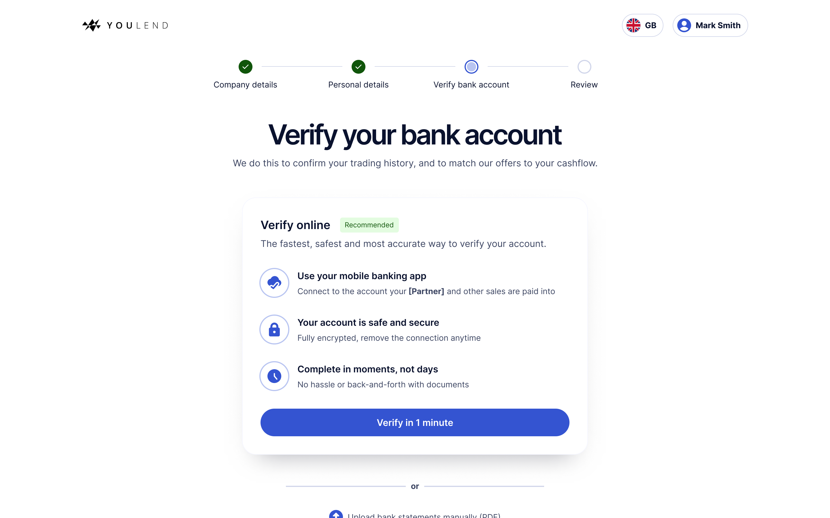
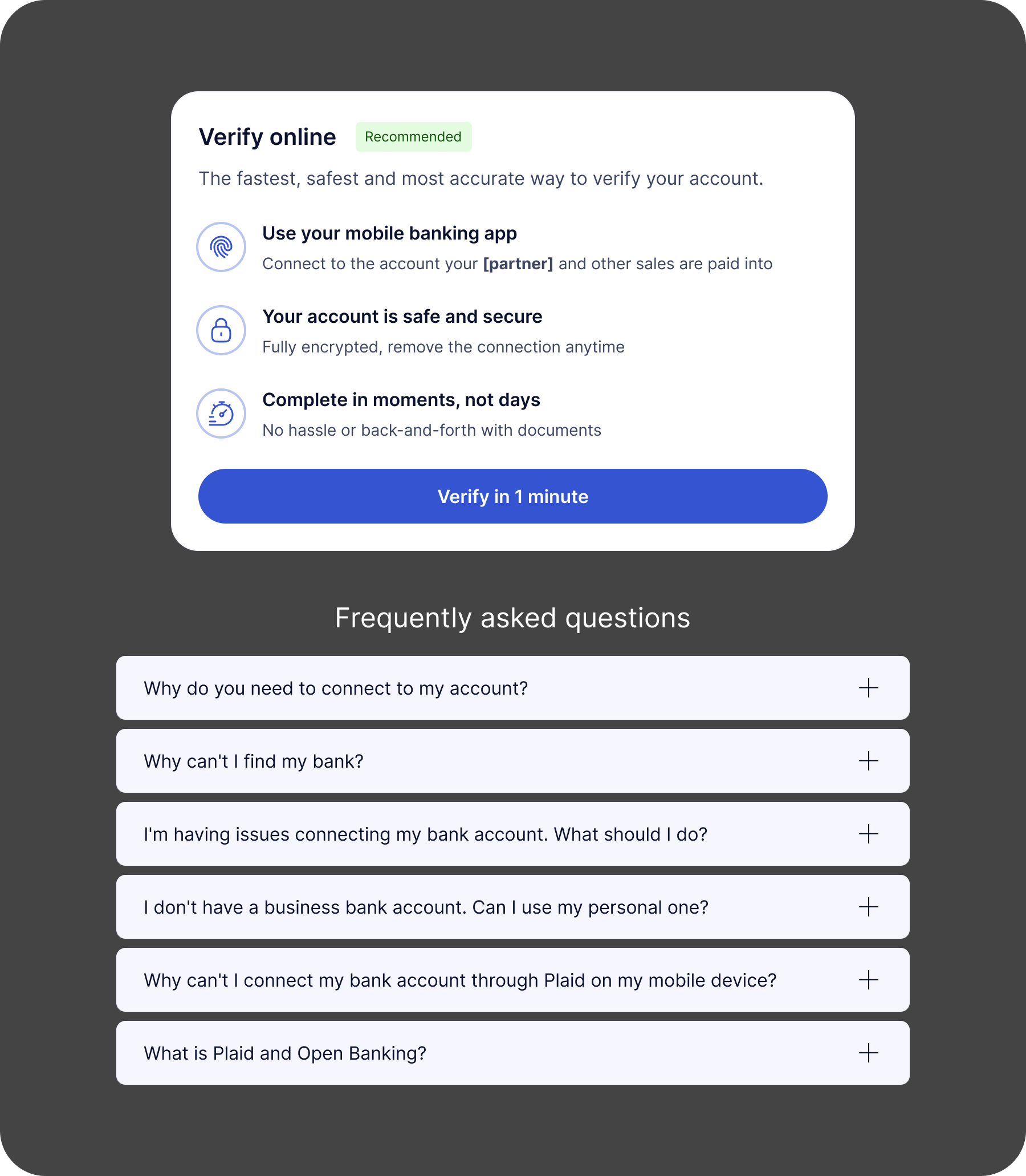
The new design prioritises the desired action, explains the reason plainly, provides social proof and some clear benefits to using this method over the manual upload, which is much more time-consuming and error-prone.
Review
The old journey did feature a final ‘submit’ screen, but it was just a screen with a button on it; somewhere for customers to rejoin the flow if they left after completing the Open Banking connection.
It didn’t align with what customers would expect from a ‘final step’ in a sign up flow, so I created a Review screen where they could look back at their information and then Submit. This felt much more like the final step in the application, and provided much-needed affordance to fix any mistakes.

Offers
Once the application is submitted and the customer has offers available, we send them to a screen where they can select the right offer amount, payment plan and fee.
As it’s one of the most important parts of the entire process, I emphasised interactivity, dynamic content and clear, easy-to-understand copy. I also included some contextual help content, rather than just relying on the FAQ section. These links, framed as questions, would open a simple modal to explain aspects of the product.
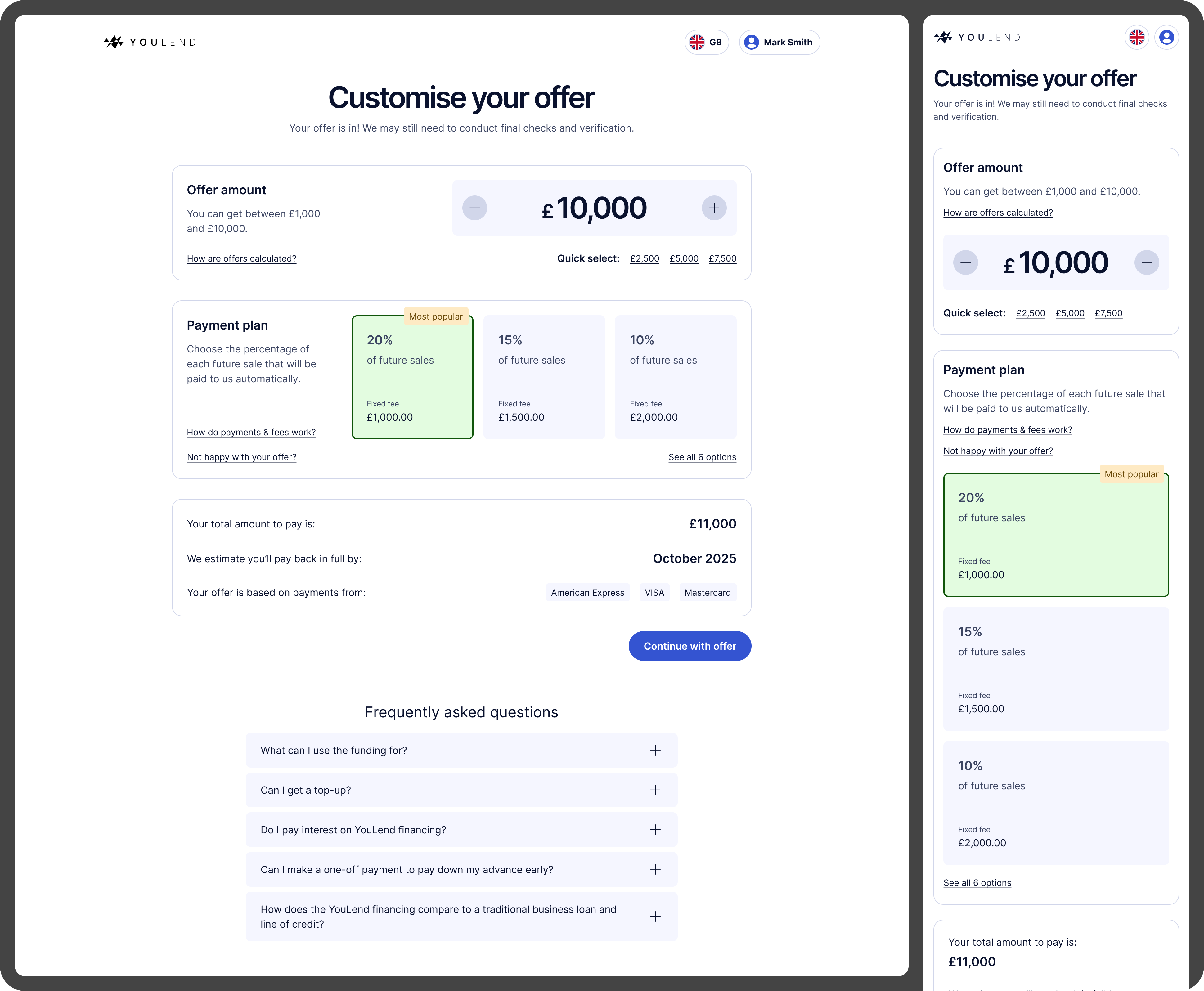
That page looks really cool. The previous version was factually all there but visually, it didn’t inspire enough excitement. But this is really good, I like it.
Head of Product (Payments), Dojo
Application status
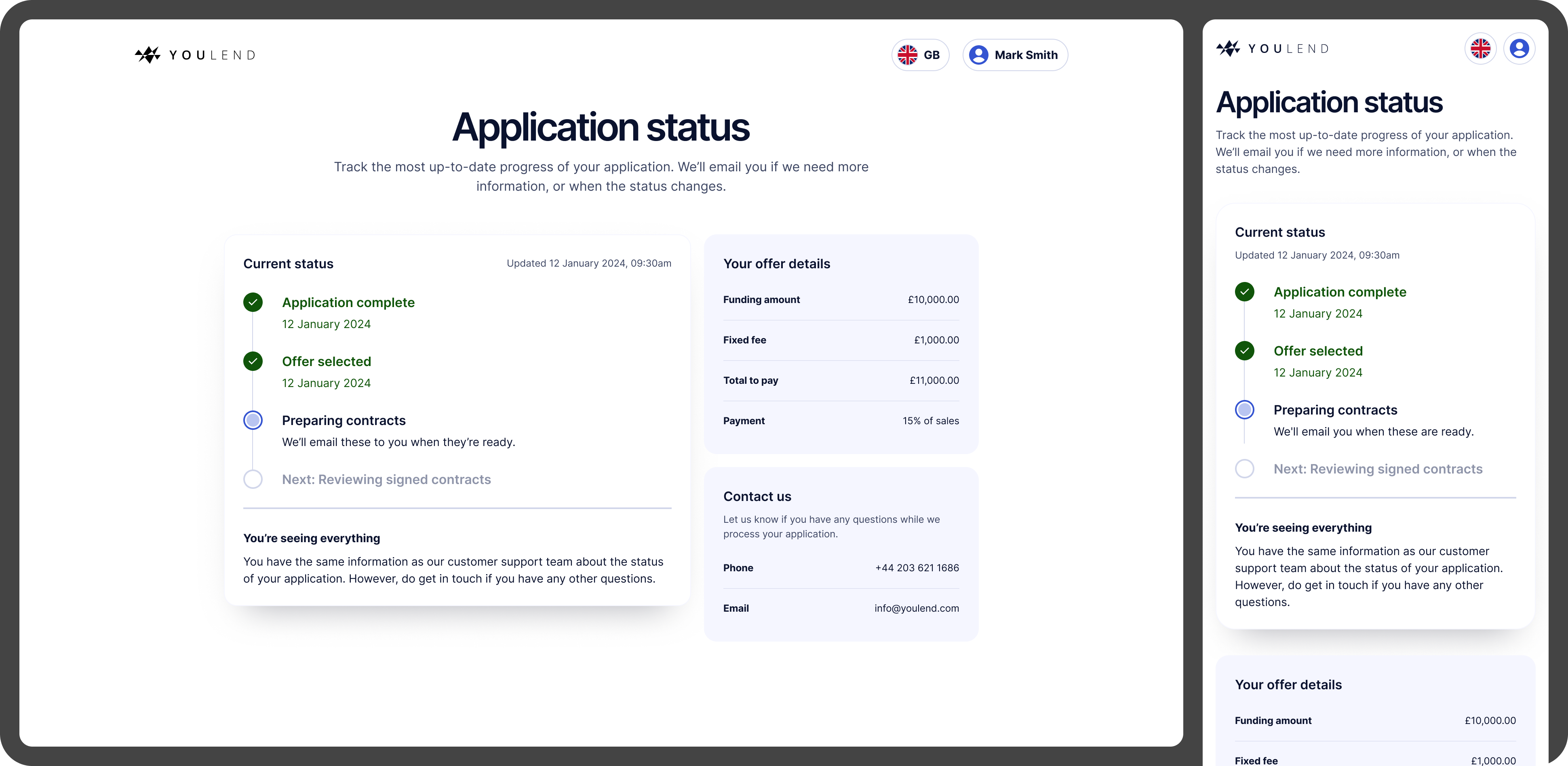
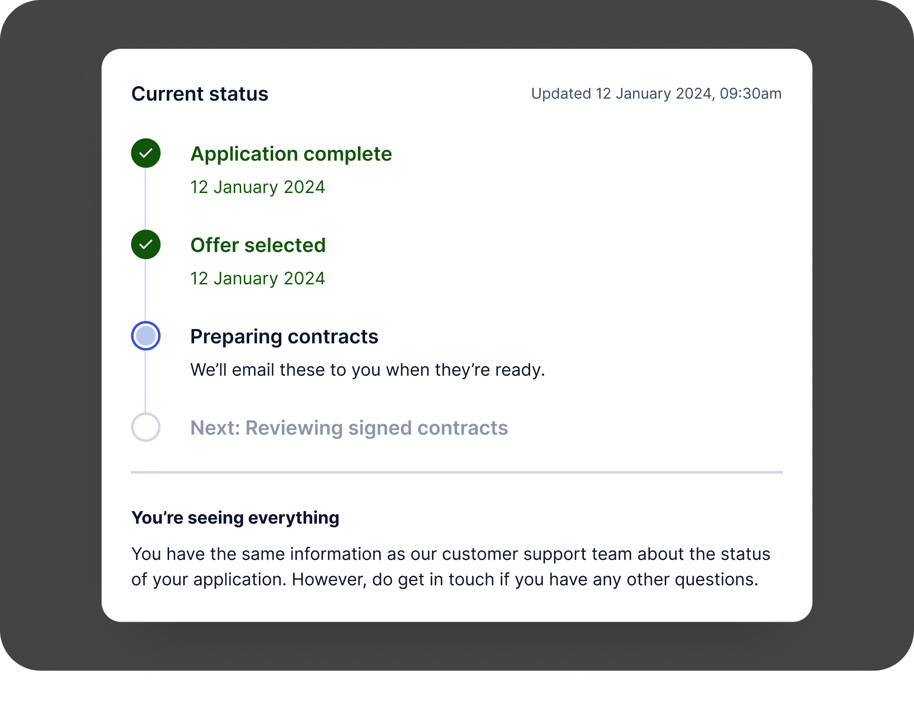
Customer Support also told us that their most popular query was ‘what’s the latest on my application?’
To help reduce inbound call volumes, we created an application status page to explain how their application was progressing and if they needed to do anything to proceed.
Testing
I used Userbrain to conduct usability testing; overall the feedback was extremely positive, but had some useful pointers too.
“It’s very transparent and clear, no difficulty in understanding what I’m needing to do.”
“‘Type of person’ sounds very awkward, could that be ‘role’ or something else?”
“Deciding on the percentage is going to slow me down slightly”
“I would do my research on YouLend first, make sure people are happy – check TrustPilot and things like that”
“Incredibly clear, everything is laid out in a way where it’s easy to fill out the information, but also I understand each process and why my information is needed”
“I think [the instructions] were really clear, I never had a moment where I didn’t know what I needed to do next. I did sometimes want to read text again but the instructions were very clear in terms of what to do.”
“Just clarify who you’re verifying with, is it YouLend or someone else”
Challenges
Product complexity
DIscussions with the wider stakeholder group revealed edge cases we hadn’t been aware of. For example, when presenting offers to the customer, we could potentially have a range of payment plans from 5-30%, incremented at 0.5% intervals. This meant we had to decide on an appropriate number to show the customer – listing 50+ options would just be ridiculous – and a way of further focusing on the most viable options, to avoid decision paralysis.
Localisation
YouLend operates in nine countries internationally, so everything from UI to contracts needs to be translated into French, Polish, Dutch, German and Spanish.
Varying word/sentence lengths can cause issues, so I designed everything with the potential for wrapping in mind, to ensure it didn’t break anything.
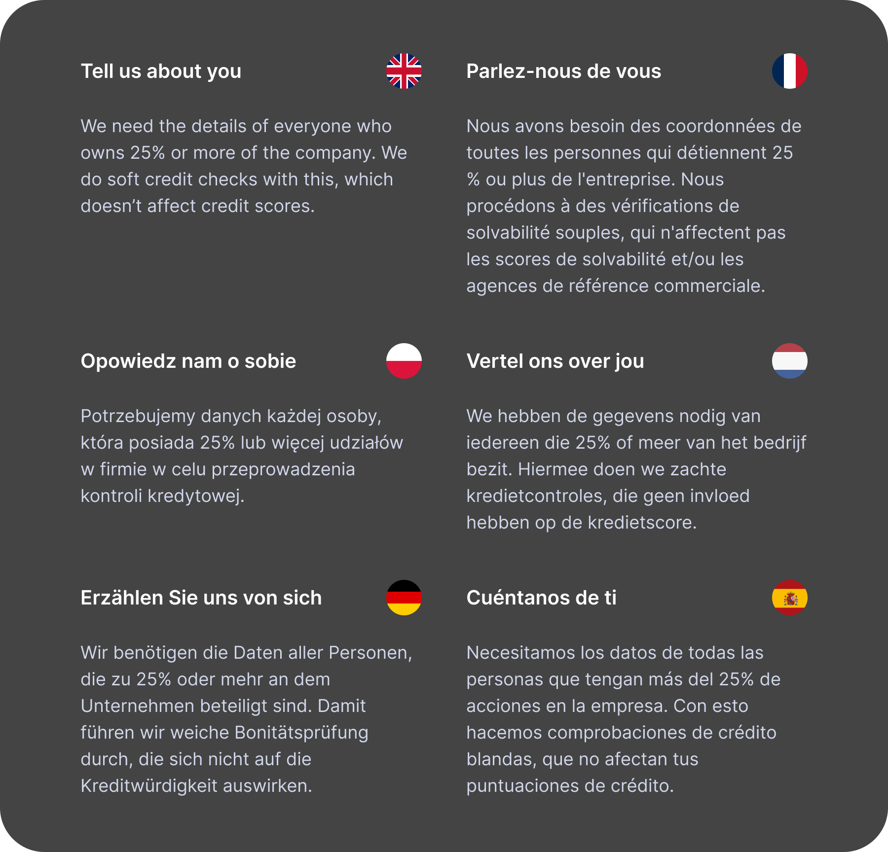
Maintaining tone-of-voice is also difficult when you’re not in control of the output. Yvonne and I worked on the copy in English, used DeepL to provide a first-draft translation and then asked native speakers within the company to double-check their respective languages.
All teams have to follow this process – it’s a bottleneck for every team, and without dedicated bilingual copywriters who can own the TOV for each language, there’s often disagreement on what the ‘correct’ translation is.
Results
At the time of writing (November 2024) the new journey is being rolled out to all partners – there is some account management/comms to consider as some partners weren’t happy to migrate without understanding the impact, which is fair.
I’ve personally led sessions with product/design teams at eBay, Amazon, Booking.com, Dojo and Mollie Capital to demo the flow to them. Everyone so far has been impressed with the redesign, and deems it a significant improvement over the previous one.
Numbers
83%
initial conversion uplift
7%
increase in Open Banking connections
55%
reduction in customer service calls about application status
10%
conversion uplift on average
It’s early days – we’re monitoring the performance in LaunchDarkly and day-by-day the new journey is definitely outperforming the old one, up to 20% in some cases.
For the application status page, in the first month after launch we saw a 55% decrease in customer service calls related to this topic, which is amazing to see.
I will update with more definitive results in a few months, as well as some insights on the expected commercial uplift.
Credits
My role
Design Lead
Tools used
Figma
Userbrain
Figjam
Miro
LaunchDarkly
Heap
Date
Spring/summer 2024
Team
Yvonne Regan, Senior Product Manager
Jessica O’Hare, VP Product
