
Context
Problem
Making payments is a core feature of Tide’s app. It was one of the first services built, and generates the vast majority of the company’s revenue.
The payments product hadn’t been optimised since 2017. Any updates had to be coded manually, and each of the main user journeys had been designed and built separately.
This was unscalable, and we would struggle to build in new functionality such as international payments, or Open Banking.
Solution
We would redesign the entire payments product from scratch, bringing together all related payment journeys, content and management into a new, DS-compliant payments area.
Research & Discovery
Vision workshop
Over two days, the team ran workshops to define the vision for the new payments proposition.
We wanted a consistent target to aim for, as well as tangible guardrails for any future updates or integrations. We discussed:
- Who is the target audience?
- What are their problems?
- What is the product category?
- What are the key benefits of this product?
- What are its key advantages?
We looked to our own in-house data to answer these questions, as well as other research materials from the likes of Accenture and McKinsey.
Next, we set definitions around four key factors — what the product is; what it is not; what it does; and what it doesn’t do.
With this information, we wrote a final vision statement:
For SMEs who need to carry out essential tasks as they grow, our payment flow is an experience-led stream that can evolve to tackle any demands. Unlike banks, our product is convenient, adaptable and non-intrusive.
We were happy with this statement overall — the word ‘stream’ felt a little ambiguous but we liked the concept of the area resembling a river, with one main flow that has several smaller tributaries feeding into it.
So no matter your starting point, you always join a flow that is pre-existing, familiar and wholly governed by our team.
Setting objectives
We defined some key objectives for the new payments area:

We would align with business OKRs on member satisfaction and revenue

Given its popularity, payments should become our company gold standard for UX

Experience should be led by what our customers need, not our technical limitations

We should combine disparate payment management features into a single payments ‘hub’
Heuristic review
In my review I identified a number of points within the existing payments flows. 37 overall – 13 severe issues, 11 intermediate issues and 13 that were performing well.
I prioritised these according to our objectives and impact vs effort, and addressed them in our design phase.
Competitor analysis
We looked at payments products from challenger banks, High Street banks and investment apps.
It felt like almost all were converging on a similar interaction pattern – a single screen for amount and reference, with a toggle to display scheduling options.
Making a payment is never really a ‘fun’ experience; it’s functional and the user needs to have explicit trust.
In other words, rather than trying to reinvent the wheel, we should focus on external consistency, familiarity and affordance to let our customers get things done fast.
Design
As we weren’t looking to explore new, exotic ways to present this product, I jumped almost straight into high-fidelity UI. We revisited our data from the discovery work and found some interesting ways that we could refine and streamline the design:

Recipients
46% of payments made by active customers had been to one of their three last-paid recipients
Idea: We could provide a ‘Recent’ section in the recipients list to optimise the flow for paying these recipients

Making multiple payments
19% of payments made by active customers were done less than 3 minutes after the previous one
Idea: We could provide the ability to immediately make another payment upon submitting a payment

Multiple account holders
80% of payments made by multiple account holders came from the primary account
Idea: We could pre-select the primary account rather than making the customer select the ‘From’ account each time

Payment management
The location of payment management features, such as managing Direct Debits and scheduled payments, was unintuitive
Idea: We could bring these features into the main Pay tab under a secondary navigation

Navigation
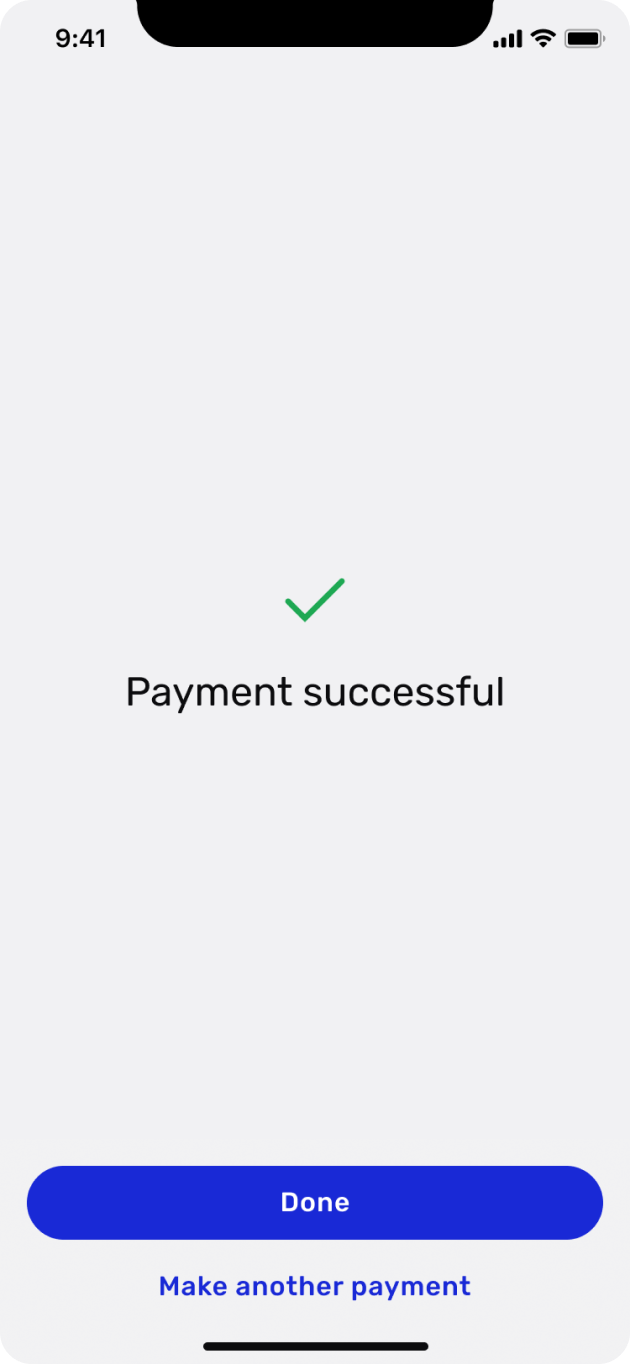
In a usability test, all users expected to be brought back to the main Account tab once a payment had been made
Idea: We could take customers back to the main Accounts tab once done, alongside the ‘make another payment’ option

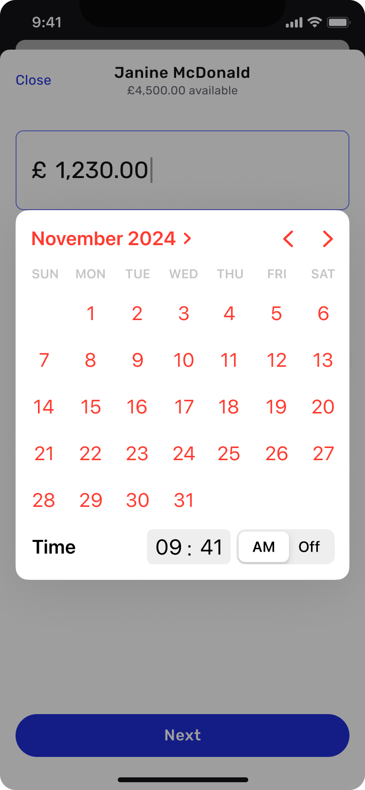
Repeated payments
When scheduling a payment to repeat/defer, over 65% of payments were ‘send once’ (don’t repeat) and send ‘tomorrow’
Idea: By pre-selecting these options, we will cater for nearly two-thirds of scheduled payments with a single tap
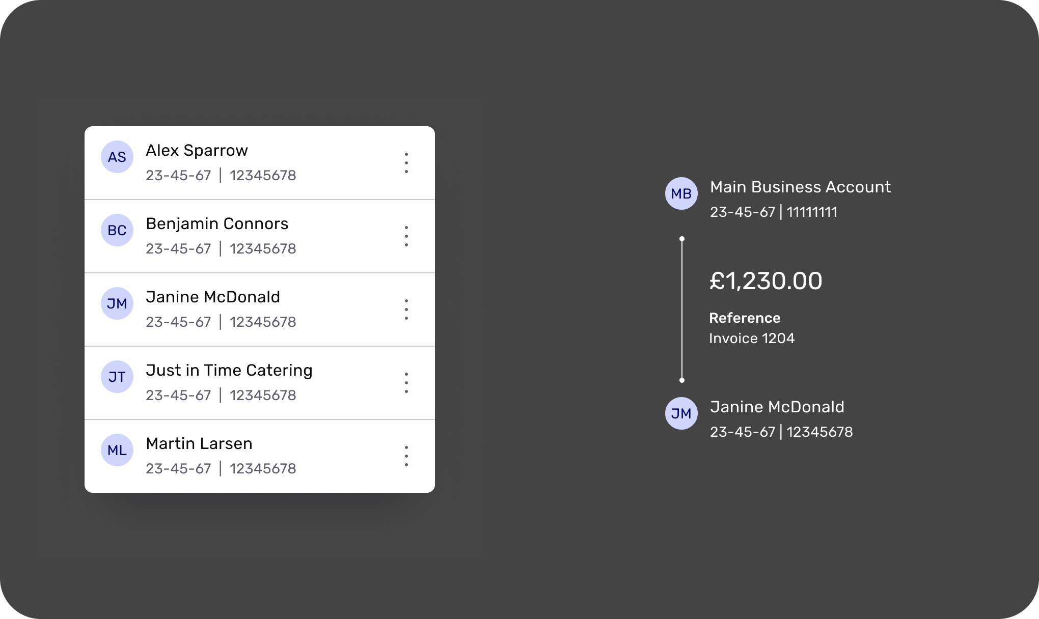
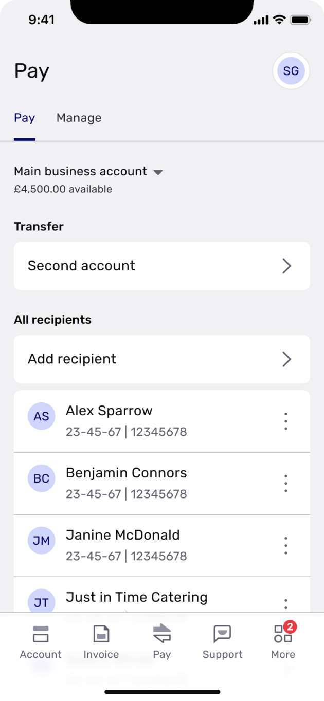
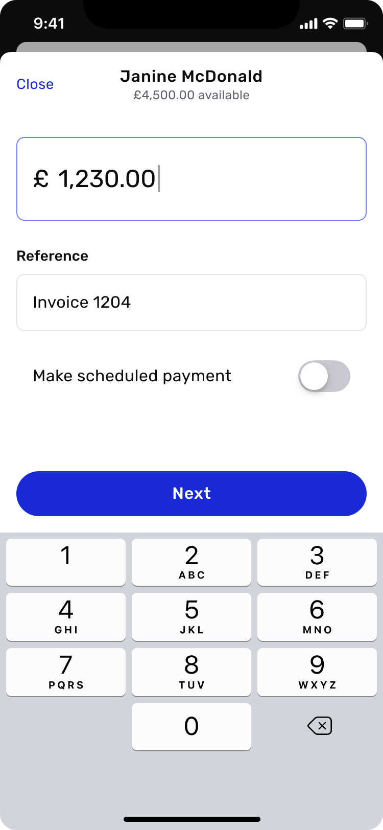
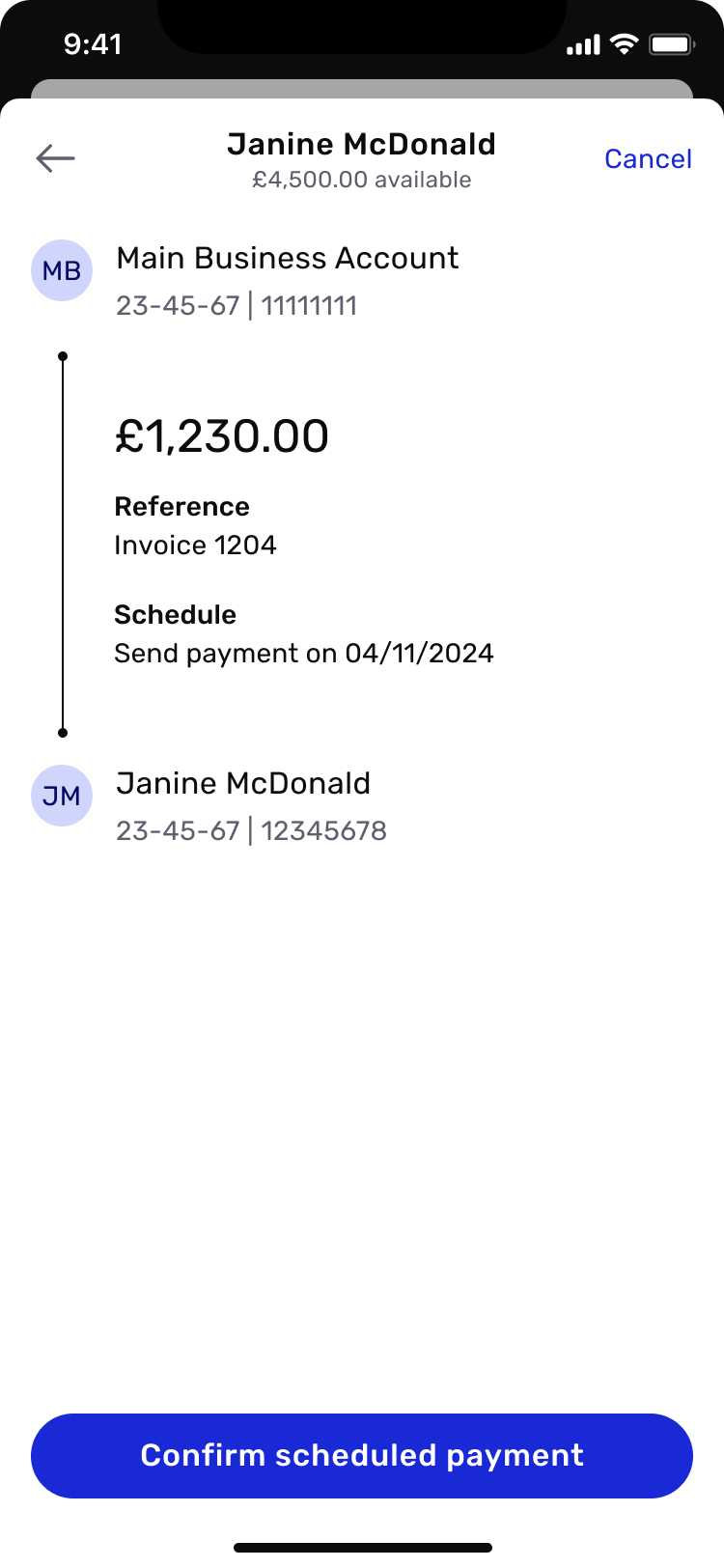
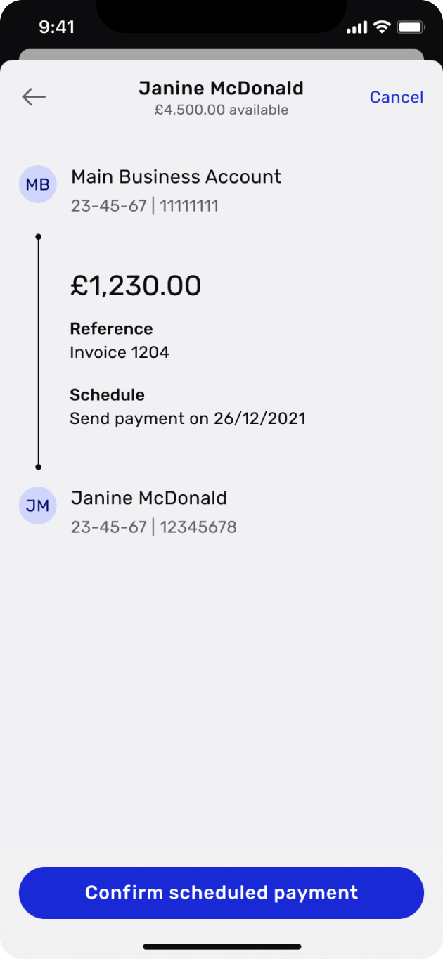
Final UI
Domestic payment

Scheduled payment

Conclusion
The new area’s modular structure allowed new services like sending and receiving foreign currency, Open Banking or even multi-currency wallets to be implemented easily.
In terms of metrics, we were quite modest as this was such a crucial function within the app:
7
point increase in our NPS (68 to 75)
9%
reduction in time-on-task
0
change to payment completion %
40%
reduction in flow churn (8.41% to 5%)
This project was a great exercise in collaboration and design thinking. Arnoud, Katie and I worked closely together over the course of several months, and our decisions were well thought out and backed by good research and data.
Credits
My role
Design Lead
Tools used
Figma
Mural
Invision
Usertesting.com
Date
Spring/summer 2021
Team
Arnoud de Nicolay, Product Manager
Katie Hayward, UX Writer